











 Download Waretracks Brand Guidelines (PDF)
Foundation
Audit & restructure
Review all copy, define the navigation hierarchy, clarify the product story and CTAs.
Industry
Client
Role
Across the German Mittelstand, countless warehouses still run on pen, paper, and aging Excel sheets. The tools that could replace them are often too complex, too expensive, or too rigid for small and mid-sized businesses. Waretracks was built to close that gap: a warehouse management system with a promise of clarity, made for companies taking their first real step into digital operations. As the company's first and only designer, my job was to make that promise visible in every touchpoint, from the brand itself to the product interface.
On this page, you will find case studies covering the rebranding of Waretracks, the expansion of its website, the design of a modular dashboard system, and the application of the brand across marketing and support materials.
Waretracks is a modular WMS built inside the G. Wurm Group, a trading company with over 66 years of logistics experience, and now run as Waretracks GmbH. When no existing WMS met their needs for an adaptable, transparent, and cost-effective solution, they built their own, inside their own working warehouse. The result is a system by entrepreneurs, for entrepreneurs, aimed at small and mid-sized businesses whose warehouses still run on pen and paper or Excel. It covers core processes such as inbound, outbound, picking, packing, shipping, and inventory management, and extends into analytics, automation, and special modules like lot control and gamification. With plug-and-play rollout and open integrations, Waretracks focuses on practical value, quick onboarding, and scaling from a single site to many.
I joined Waretracks in August 2025 as a full-time UI/UX & Brand Designer, and as the first designer in the company. This meant owning design end to end: brand identity, product interface, website, and marketing assets. My first major task was rebranding the company, replacing an in-house retro-gaming aesthetic with a minimalist identity built around the pixel. From there, I expanded the website from an outsourced landing page into a complete, on-brand digital presence, and designed a modular dashboard system for the WMS itself. Working closely with the product owner and the development team, I also established the design system and brand guidelines that allow the brand to be applied consistently.
Waretracks launched with a brand created in-house, before any designer had joined the company. Built on a retro-gaming concept, it was distinctive but worked against the product: too playful for a B2B audience, with a logo that broke down at small sizes. I led the rebranding from concept to guidelines, transforming the gaming idea instead of discarding it entirely. The result is a minimalist identity built around a single element, the pixel, representing structure, control, and the modular nature of the system.
The original brand leaned fully into retro-game aesthetics. Headlines spoke of power-ups and game overs, visuals borrowed directly from arcade games, and typography and iconography varied between touchpoints. The idea had a real foundation, since gamification is an actual module of the product, but the execution felt childish. For a system that businesses trust with their daily operations, that was a credibility problem. Warehouse managers evaluating a WMS need to see reliability, not nostalgia.
Design a brand that keeps the playful side of Waretracks without undermining its seriousness. The new identity had to signal clarity, precision, and control, work flawlessly from a warehouse tablet to a trade fair banner, and be simple enough for non-designers to apply consistently.
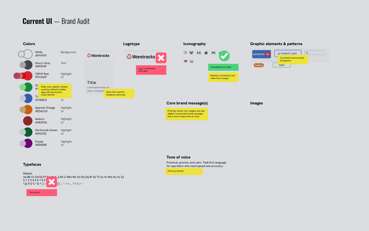
As part of my application, Waretracks asked me to redesign selected slides from their pitch deck in a new visual direction. Instead of jumping straight into design, I started with an identity audit of the two main brand touchpoints: the pitch deck and the website. The findings showed a brand pulling in different directions.
Typography: The deck combined two display typefaces, Arcade Gamer and NT Brick Sans, that didn't pair well and both leaned into the 90s game style. The website used NT Brick Sans for display but defaulted to System-UI for body text, which changes with the device and offers no consistency. Deck and website effectively spoke two different typographic languages.
Color: The core palette (Eerie Black, CMYK Red, Oxford Blue) was solid but incomplete. Oxford Blue appeared in the deck yet was absent from the website, and the palette lacked a highlight color for visual dynamism and flexibility.
Iconography: The deck mixed six different icon styles, from Microsoft Fluent emojis to pixel art. I proposed consolidating them into two standardized formats: 24 px for small-scale use and 64 px for larger applications.
The audit also defined what was worth keeping: the sans-serif body typography, the existing core palette, and the logotype. Together with a moodboard built from well-rated B2B pitch decks, this gave the redesign a clear brief: elevate the look to something polished and contemporary, while retaining subtle retro-gaming cues.
The redesigned trial slides became the seed of the final brand. A dot-matrix display type replaced the arcade fonts, evoking LED warehouse displays rather than video games. Isometric 3D blocks, falling into place to form the logo mark, translated the Tetris idea into something spatial and architectural. A subtle pixel-grid pattern gave dark backgrounds texture and depth. Nearly every one of these decisions survived into the final identity: the dot-matrix type led to Doto, the highlight color proposal led to the extended palette, the two-scale icon system became the official 24 px and 64 px formats, and the 3D block style grew into the brand's visual world.
The defining decision of the rebrand was already present in the trial task: dropping the literal retro-gaming aesthetic without abandoning its DNA. Instead of using game references as they were, we elevated them. Tetris, at its core, is about order: fitting blocks into place, keeping structure under pressure, clearing chaos. That is exactly what a warehouse does. From this idea emerged the pixel element, a single building block representing structure and control, translated into digital form. Each pixel stands for the modular, scalable nature of the system, and for precision through simplicity.
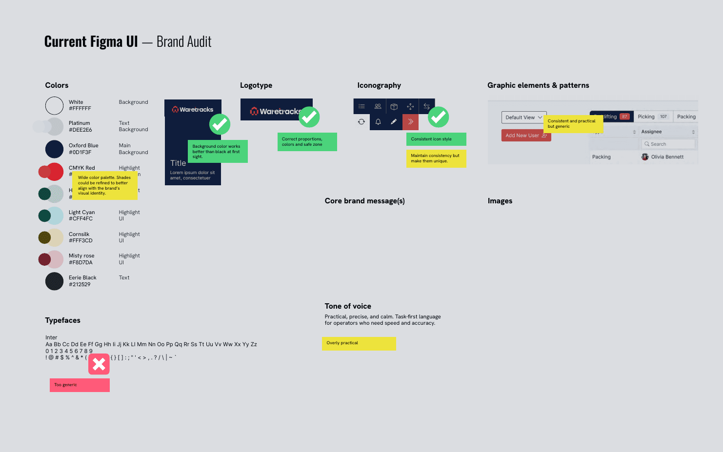
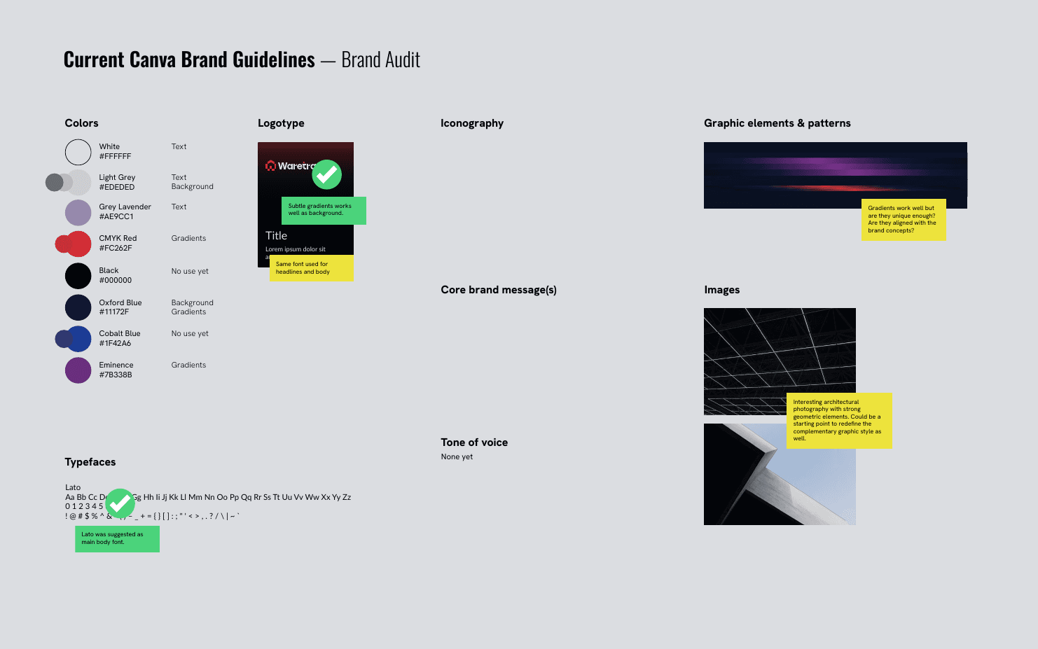
I joined the company on August 11, 2025. Four days later, I presented the full rebranding concept. The trial task had covered the pitch deck and website, but the complete picture required more. I extended the audit to six touchpoints: the website, the pitch deck, the product UI, the Figma design files, the Zebra scanner interface, and an early Canva guidelines draft. Each told a slightly different story. The product UI ran on Roboto with a sprawling ad-hoc color palette, the Figma files used Inter, the Canva draft suggested Lato. Six touchpoints, five typographic approaches, and no shared rules.
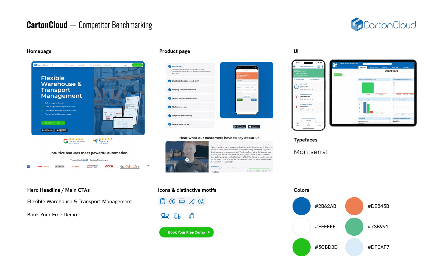
I then benchmarked five competitors: Manhattan Associates, CartonCloud, Körber, Blue Yonder, and WEMALO. Two patterns stood out. Most competitors showed a clear gap between their marketing visuals and their product UI, which followed its own rules. And typography across the field was narrow, often a single family used everywhere, limiting hierarchy and character. Both findings became direct opportunities: unify website and product under one visual system, and build a type pairing with dedicated roles.
Before designing anything final, I defined the brand's foundation together with the team. The essence was distilled into one line: Die Kraft des Machens, the power of doing. Five core concepts (usability, practicality, innovation, reliability, adaptability) were each translated into concrete design cues. Usability meant a humanist typeface and WCAG AA contrast as a minimum. Practicality meant a grid-first approach, real warehouse photography, and no abstract art. Adaptability meant light and dark modes, fluid sizing, and modular, flexible brand elements. This mapping made every later design decision defensible: nothing was styled for taste alone.
I kept Lato as the main typeface, as the team leads had suggested in their early guidelines draft. As a humanist sans-serif it matched the brand values, performed well on screen, and honored the work done before my arrival. The open question was display type. I tested multiple directions in full mockups, day and night mode: Doto, Roboto Serif, Inria Serif, Arvo, and Aleo, the last being Lato's slab-serif counterpart and a natural pairing. Doto won. Built from a grid of dots, it echoes the pixel element and evokes warehouse hardware, label printers, scanners, LED displays, rather than video games. It carries the brand's technical character without the 90s costume.
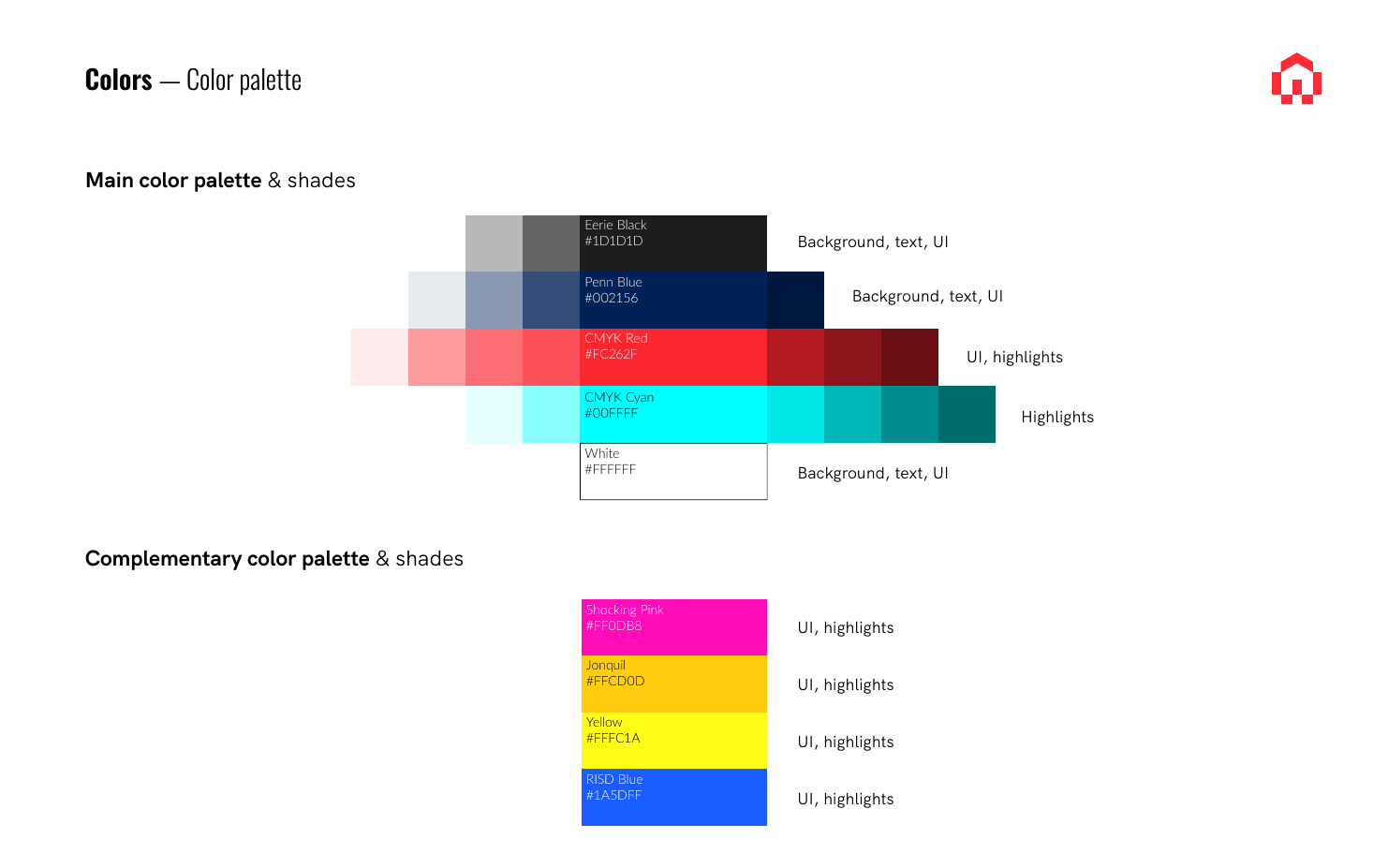
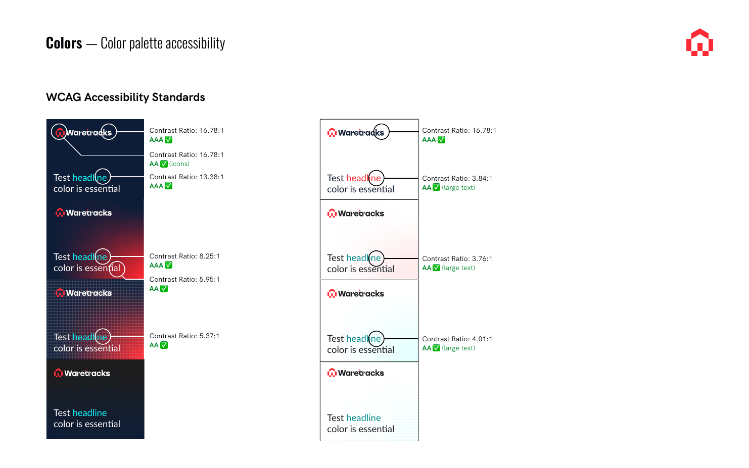
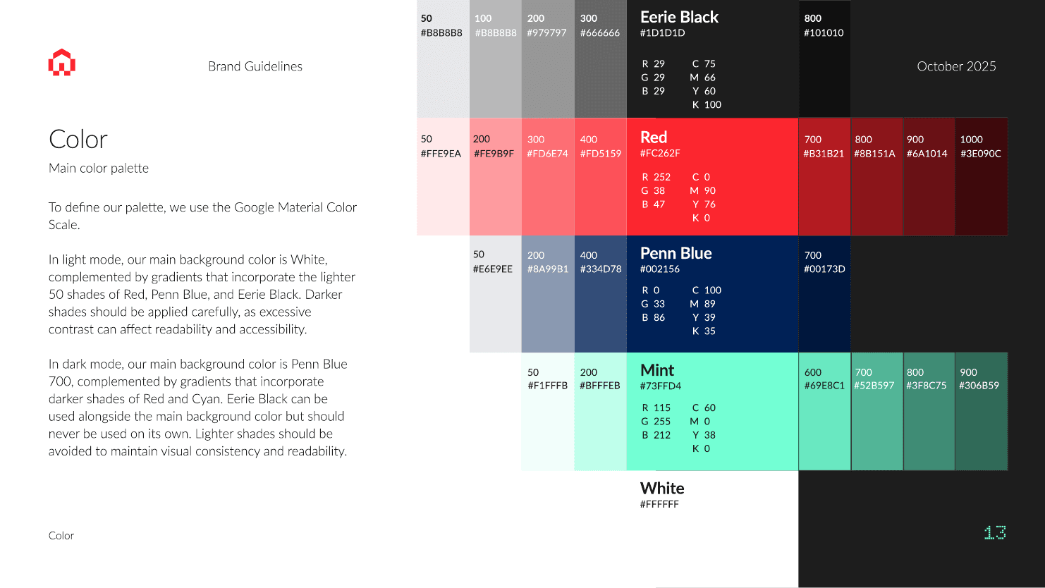
The core palette survived the audit: Eerie Black, CMYK Red, and a deep blue, refined into Penn Blue. Following the audit's call for highlight colors, the palette was extended with a set of vivid accents and tested against WCAG accessibility standards, with contrast ratios documented for every key combination on both light and dark backgrounds. Light and dark modes are a deliberate part of the identity, not an afterthought: they mirror how the software adapts to different contexts, from bright offices to dim warehouse floors.
The secondary palette didn't stay fixed. The first proposal included loud accents like cyan, shocking pink, and RISD blue. In daily use, some colors were consistently preferred while others barely appeared. Brands are living systems, so instead of defending the original set, we redefined the secondary colors based on actual usage, arriving at the softer mint, yellow, and salmon documented in the final guidelines.
The audit counted six icon styles in use across touchpoints. The new system replaced them with one language built from the logo itself. From the isotype I extracted two core modules, a square and a 30 degree slanted rectangle, and used them to redesign icons from the open-source Pixelarticons collection. The result keeps the brand's pixel-art roots while making every icon unmistakably Waretracks. The set follows two standardized scales, 24 px for UI and 64 px for display use, and is built to grow over time.

The pixel-grid texture introduced in the trial slides evolved into the brand's core graphic system. The pixel became the central element across every touchpoint, extended into two complementary background patterns on a 5 x 5 px grid, one for light mode and one for dark. Patterns can be applied at different opacities, on flat backgrounds or combined with gradients, adding depth without reducing readability.

To reinforce modularity, I designed an isometric block element: cubes and elongated blocks that assemble, stack, and fall into place, directly descending from the elevated Tetris idea. First shown forming the logo mark in the trial slides, the element matured into a flexible system used across hero visuals, animated for additional dynamism.
The benchmarking showed most competitors using authentic warehouse photography, and the audit flagged the risk of low-quality AI images for a brand selling trustworthiness and know-how. The direction followed from both: real, on-site photography with a geometric bias. Shots of warehouses and buildings, with or without people, always containing a structural element, either brightly lit or captured as sharp night photography.





The logotype was one of the few elements the audit marked as worth keeping, so it stayed untouched through the first phase. Once the system around it had matured, I returned to it in September with a dedicated refresh. The wordmark was set in a modified Stolzl Medium, and four problems had become clear: the heavily modified r competed with other custom elements instead of supporting them, the sliced square above the t no longer aligned with the new identity, the curve connecting t and e was inconsistent with the rest of the design, and the wordmark and isotype were centered metrically but not optically. I developed six proposals, ranging from minimal corrections to more angular reconstructions. The final direction straightened the W, rebuilt the r, t, and k with 30 degree cuts matching the isotype's geometry, and reintroduced the pixel element, tying wordmark and symbol into one construction logic.
The rebrand was consolidated in a comprehensive brand guidelines document, finalized in October 2025. It covers logo usage and misuses, color, typography, iconography, patterns, cards and UI components, imagery, and photographic style, with practical rules and examples throughout. Since Waretracks operates without a large design team, the guidelines were written to let anyone in the company, from marketing to development, apply the brand correctly.

The rebrand gave Waretracks an identity that matches its product: clear, structured, and functional, with every element serving a purpose. The pixel proved to be more than a logo device. It became a system, extending naturally into patterns, icons, typography, and UI components. Most importantly, the new brand resolved the tension the company started with. Waretracks no longer has to choose between personality and credibility. The playfulness is still there, refined into a form that a warehouse manager can trust.
While I was developing the new brand, the first Waretracks website was built in parallel by outsourced freelancers: a single landing page meant to establish an online presence quickly. It served its purpose, but it was a low-fi placeholder, off-brand and not built to grow. Once the rebrand was defined, I took over the website entirely: benchmarking competitor architectures, proposing and refining a new information structure, applying the new identity, and running a month-by-month roadmap that treated the website as a product, not a brochure.
The outsourced landing page was created before the new brand existed, so it inherited the retro-gaming look: arcade typefaces, emoji icons, "Game On" copy. Beyond aesthetics, it had structural limits. One page had to serve every audience at once, from CEOs evaluating a WMS to warehouse managers comparing features. There was no room for depth, no dedicated feature pages, no tracking, and no foundation for SEO. As the product matured, the website needed to mature with it.
Turn the landing page into a full website: define a scalable information architecture, apply the new brand identity consistently, present the product's modular feature set in depth, and build the infrastructure for measurement, lead generation, and organic growth in both German and English.
Before proposing a structure, I mapped the full site architecture of two German competitors serving the same SME segment: WEMALO and Pulpo WMS. Page by page, I documented their navigation hierarchies, content types, and conversion paths, from feature and integration pages down to resource centers, pricing, and demo flows. The comparison revealed the patterns that work in this market: solution pages split by role and business type, integration pages as SEO surface, case studies structured as challenge, solution, and impact, and a demo as the central conversion goal.
Based on this, I developed three architecture proposals of increasing focus. The first was the most expansive, with dedicated industry landing pages and a full resource system. The second consolidated toward the essentials: functions, solutions, resources, pricing, a demo center, and contact. The third refined that further, adding an About page built around the origin story and a careers section. The final structure was decided together with the team, balancing ambition against what a one-designer company could realistically maintain.

The website work was planned as an eight-month roadmap from November 2025 to June 2026, structured in parallel tracks. The foundation came first: a full audit and restructure of existing copy, a new navigation hierarchy, audience definition, GA4 and Tag Manager tracking with event-level measurement, CRM connection, a Looker Studio dashboard, and on-page SEO groundwork from metadata to page speed.
On top of that foundation, the roadmap layered growth work in stages: a CMS-based blog with a regular publishing rhythm, audience-tailored landing pages for campaigns, a lead magnet built around a whitepaper, case studies with metrics, and a guided interactive product demo that later evolved into a fully clickable dashboard simulation. New core pages shipped along the way: Functions, About Us, Pricing, a Demo Center, and Industries, followed by a home redesign. Recurring GA4 reviews, UX audits, and conversion optimization sprints kept the whole system honest, with decisions driven by real usage data instead of taste.
Blog publishing + GA4 review run as a constant cadence across all eight months — the site keeps learning while the roadmap builds.
The first landing page had been built by external freelancers in Webflow as a quick, low-fi version. Rather than starting over, I kept the platform and rebuilt on top of it: I turned that single page into the new home and expanded outward into the full architecture, designing and building every page myself directly in Webflow. This kept the site fully in my hands, easy to iterate on, and consistent from the ground up.
The website became the first large-scale application of the new identity, and in many ways its proving ground. Doto headlines, pixel-grid gradients, the icon system, and the isometric visual world all had to work in a real, scrolling, responsive context rather than in presentation slides.
Both day and night mode were designed from the start, staying true to the brand's dual-mode logic. Night mode shipped first, giving the site a distinctive dark presence in a market of predominantly light, corporate WMS websites, with day mode prepared as a follow-up.
Every page received its own hero image built in the 3D isometric style defined during the rebrand: blocks assembling and falling into place, the elevated Tetris idea carried onto the web. I animated these heroes in Jitter, adding motion that reinforces the concept: a system where everything finds its position.
The iconography also came alive. I expanded the icon set for the website and animated it in Jitter, with a clear goal: the brand should feel fluid and in motion, mirroring a warehouse that never stands still. The same thinking extended to a series of isometric illustrations designed for key sections. They broadened the brand's asset library, gave the services sections stronger visual explanations, and were built with future animation in mind.
The site also had to represent a product still in transformation. The modular dashboard and renovated product UI were not yet complete in the software itself, so I designed a preview of the foreseen dashboard and placed it on the home page directly below the hero. The website didn't just reflect the product's current state. It showed where the product was going.
The old page carried more than a dozen competing slogans, an issue flagged in the brand audit. The audit-and-restructure phase addressed it directly: copy was reviewed, repetition removed, and messaging consolidated around a few core concepts, such as built by businesses for businesses, ready in 24 hours, and clarity as the product promise. The copy itself was written mostly by our Managing Director for Operations, Marketing & Sales, Simon Willmes, with PR agency Hungriger & Hirsch contributing minor messaging and SEO adjustments. My role was to structure the content across both languages, German first with a full English version, and give it a clear hierarchy on the page.
The website completed the arc that began with the trial task: from an inherited placeholder to a coherent digital presence that speaks the brand's language on every page and is instrumented to learn from its visitors. More than a redesign, it became infrastructure: an architecture benchmarked against the market, a measurement stack that turns traffic into insight, and a publishing system that grows the site page by page without breaking it.
Waretracks had a working warehouse management system and no clear idea of what its dashboard should show. Every number the product could report already existed somewhere in the interface, spread across dozens of screens, but nothing was connected. This was the one part of the product where design could not start with a layout. It had to start with the data.
I mapped the entire system, worked out which combinations of data would actually change someone's day, and designed a modular dashboard around them: a set of widgets each user assembles themselves, with two different ways of reading the same numbers.
A dashboard is the easiest screen to fake and the hardest to get right. It is simple to produce something that looks like one: KPI tiles, a line chart, a pie chart, a red badge.
That is what I inherited. An early concept lived in the Figma file with no interaction behind it, a placeholder built to explore what a dashboard might look like rather than what it should contain. It made the real problem visible. Nobody could say what belonged on it.
The other half of the problem was the audience. A warehouse is not one user. A managing director needs to know whether the week will hold. A picker needs to know what to do next. Serving both from a single fixed layout means burying one of them in information they will never use.
Decide what to show, based on the data that actually exists rather than on what dashboards usually contain. Make one system serve very different roles without compromising for either. Keep information density adjustable instead of fixed. And build it so it grows with the product, since the product was still being built around it.

Before designing anything, I documented the system as it was. I went through every screen of the WMS and recorded what data it held: 29 tables covering tasks, users, customers, articles, stock, stock movement, inbound containers, outbound orders, locations, stock optimisation, shipments, packing, inventory and the archive. Every field, every status value, every identifier that could link one table to another.
That inventory made two things obvious. First, the product already knew far more than it showed. Second, it defined six distinct user roles, which meant a single dashboard was never going to work.

A field on its own says nothing. Outbound orders are just rows. Outbound orders crossed with status and time show whether the backlog is growing. So the next step was to define the crossings: which tables to join, on which keys, to answer a question someone actually asks on the floor.
I documented 30 of them. Each one names the entities involved, the join keys, the operational question it answers, and the visualisation that fits. I then ranked them by how much the answer would change a decision: 12 high, 10 medium, 8 low.
The high-priority set is the operational core. Outbound orders by status over time. Inbound containers and receiving progress. Work in progress by task type and status. Picking and packing rates per user. Forklifting activity by location. Stock on hand by location, and demand by article. Shipment density against fixed carrier dates.
That ranking became the design brief. It decided which widgets got built first and what the default view should contain.
During the concept phase we kept circling the same disagreement: should the dashboard show the data or interpret it? Raw charts are honest but slow to read. Interpretation is fast but hides its own reasoning.
I proposed doing both, as a single toggle. Data Mode shows the chart. Insights Mode replaces it with a short plain-language reading of the same widget plus one action button. Same widget, same data, different level of interpretation, chosen by the user rather than by us.
The examples in the prototypes come straight from the crossings. Outbound orders in Data Mode is a stacked area chart of order status over four weeks. In Insights Mode it reads: backlog grows between 11:00 and 13:00, start batch picking in Zone C, with a Start Batch Picking button. The chart tells you what happened. The insight tells you what to do about it.


The dashboard answers questions you go looking for. Some things you should not have to look for at all.
I proposed a fixed left-hand panel, "Today at a glance", holding only what is relevant right now and adapted to the role: heads-up items with a time on them, such as a carrier cut-off in 90 minutes with 18 shipments not ready; the KPIs that matter today, such as receiving progress and orders due; and alerts with a single action attached, such as 14 overdue purchase orders with an Open POs button.
It is deliberately the least configurable part of the screen. Everything to its right is the user's to arrange. This column is the system's.

The reference point was not other warehouse software. It was the home screen of a phone. People already know how to add a widget, resize it and drag it where they want it. Applying that model meant we never had to design a "manager dashboard" and an "operator dashboard" as separate screens.
Every module is a widget. Users pick which crossings they want to see, choose the size of each one, and arrange the grid. We designed against six role groups: Admin, covering head of logistics, operations director and managing directors, then warehouse manager, shift supervisor, inventory controller, inbound, and picker or packer. A warehouse manager builds a wide view of throughput and carrier schedules. A shift supervisor builds a dense view of task status and zone activity. Nobody is shown information they will never act on, and information density becomes a per-user setting instead of a design decision made once for everyone.
The prototypes were built greyscale and unstyled on purpose. With nothing decided about what the dashboard should contain, form would only have hidden the gap. Brand styling was scoped as the step after the structure was agreed.

The work started in November 2025. The concept phase ran for about a month: the data inventory, the crossings, the ranking, the two modes, and the prototypes.
It was a small group. I worked with Simon Willmes, Managing Director for Operations, Marketing and Sales, on scope and priorities, and with the technical team on what the system could realistically serve: Milan Milinić as Technical Team Lead, Miloš Stolica as Solution Architect, and Svetislav Mijatović as Front-End Lead. The concept had to be buildable, and having the front-end lead in the room during the concept phase is why it was.
In December 2025, Svetislav demonstrated a working code prototype: a genuinely configurable dashboard where the user selects the widgets, chooses the data crossings behind them, and sets the size of each one. The phone home screen model, running on real data. That was the proof the concept held up outside Figma.
The dashboard was still in development when my role ended, running alongside the website and brand work as one track of a larger product roadmap.
The dashboard was the part of the product where design could not lead with visuals. There was no brief to interpret, only a system that knew a great deal and showed almost none of it. Starting with 29 tables and ending with 30 ranked crossings was slower than sketching a layout, but it meant every widget that followed answered a question someone in a warehouse actually asks.
The result was a model rather than a screen. Widgets a user assembles, two levels of interpretation on the same data, and one fixed column for what nobody should have to look for. It gave a six-role product a single dashboard without forcing six compromises, and it gave the development team something specific enough to build from. The prototypes also went further than the product itself: they became the dashboard preview on the Waretracks home page, showing customers where the product was heading before it arrived there.
A brand system is only real once it has to survive contact with an NDA, a sales deck, a LinkedIn carousel and a printer. This last section covers the applied work: the touchpoints where the identity from Case Study 1 stopped being a set of rules and started doing a job.
Most of it was routine. One piece of it changed the direction of the brand.
The first thing a new brand has to handle is paperwork. I built a document system covering the letterhead, the NDA template, short customer-facing documents like the initial WMS questionnaire, the envelope, and the presentation folder.
The design problem here is restraint. A legal document has to be readable, printable and unremarkable, so the brand shows up in small structural decisions rather than in visuals: red section numbering, the pixel element as end-caps on the horizontal rules, page numbers set in small red blocks, and a footer that carries the legal details without crowding the page. The folder and envelope carry the heavier brand load, using the isometric visual world and the dark mode palette.

The pitch deck was the touchpoint that had been audited during the trial task, so redesigning it closed a loop that opened on my first week.
The deck alternates dark and light sections to give a long sales conversation some rhythm, uses Doto for headlines and section markers, and leans on the icon system and the isometric cube to explain modules and features visually rather than in bullet lists. Product structure is shown as a split between base modules and flex modules, and the pricing tiers are named rather than numbered.
It is also where the brand's origin stayed most visible. Case Study 1 describes dropping the literal retro-gaming aesthetic while keeping its DNA. The deck copy was written before I designed it, and it still spoke in that language: the tiers are power-ups, the onboarding stages are levels, the closing slide invites the customer to play. My job was to build a visual system that could hold that tone without falling back into the old aesthetic. The pixel element, Doto and the isometric cube did that work. The voice stayed playful, the design did not.
Two whitepapers, both built as self-scoring checklists rather than brochures. The first, "Der 10-Minuten-Check für dein Lager-Fundament", scores operational stability and transparency across sixteen questions and plots the result on a two-axis matrix. The second, "Der 10-Minuten-Potenzial-Check", rates sixteen areas on a one-to-five scale and converts the score into a euro range of annual savings potential.
The design job was making a self-assessment that people actually complete. That meant checkbox columns wide enough to tick on paper, a scoring flow broken into numbered steps, a results matrix legible at a glance, and a worked calculation example so the final number never feels abstract.


The LinkedIn presence needed to change with the brand. The previous header was built around the old logo and carried a co-creation credit for 369 Studio, a marketing studio made up by some current Waretracks members. The replacement drops all of it for the brand's own voice, setting "Entwickelt im Lager, nicht im Labor" in Doto against the pixel-grid ground with the isometric blocks assembling at the right edge. I built it in both dark and light versions so it could sit alongside either mode.
For LinkedIn announcements I designed a carousel format using the brand's angular masking system: photography cut into hexagonal and triangular shapes over the pixel grid, mixing real warehouse and team photography with the isometric element and the 24-hour graphic. Real photography of the actual warehouses gave the posts a physical weight the isometric visuals alone could not.


The icon family grew into a production asset rather than a style guide page. I delivered it as SVG at both scales, 24 px for interface use and 64 px for display, in light and dark colour schemes, so the same set could serve print documents, the deck, the website and the product.
Single color plus pixel. Used in buttons, navigation, forms and toolbars.
Two color system, black or white with red. Used in dashboards, feature highlights and marketing.
I also produced a product feature video. The tech team supplied screen captures of the software, I built the intro and outro around them and generated the voice-over with ElevenLabs, so the demo carried the brand from the first frame instead of starting cold on a UI recording. It went out to new clients internally. It was meant to be the first of a series but the series stopped after the first video when engineering capacity moved elsewhere.
The first business card was correct. Logo, dark ground, isometric blocks, a QR code on the back. On brand, and unremarkable.
Then I went back to something I had seen on every warehouse visit. Every box carries a label, and every label carries a barcode. Not decoration, but the actual mechanism by which a warehouse knows what it is holding. So I redesigned the card as a warehouse label: a real, scannable barcode instead of a QR code, set on the secondary palette rather than the core one.
It worked because the metaphor was not borrowed. A company that builds warehouse software handing you the same thing a warehouse hands its own system is the product explaining itself in one object. Simon Willmes approved it and had his card printed that way.
The card then stopped being a card. It suggested a version of the brand that was warmer, more physical and more tied to the daily reality of the people using the software than the minimal system we had built. That direction was scoped to expand across the brand, starting with the website.


I built a full homepage concept in that direction to test whether it held at scale: barcode dividers, label-block headlines, the secondary palette used as structural colour rather than accent, and the checklist and card patterns from the whitepapers carried into web sections.
It was also the first time I built with Claude Design, shortly after its release, which meant the concept existed as working responsive HTML rather than as a flat mockup. It stayed a concept.
From August 2025 to August 2026 I was the only designer at Waretracks. That meant the brand, the website, the product interface and every marketing asset ran through one person, usually at the same time.
Working that way exposes a pattern you don't notice on a larger team. Every one of these projects went better when it started with structure instead of appearance. The rebrand began with a positioning line, not a moodboard. The website began with an architecture and an eight-month roadmap, not a redesign. The dashboard began with 29 tables and 30 ranked data crossings, not a layout. In each case the visual work was faster and less arguable once the underlying decision had already been made.
The same pattern explains the one thing that surprised me. The piece of work that changed the brand most was not the rebrand. It was a business card. Looking at how a real warehouse labels a real box produced something the brand system on its own would never have arrived at, and it opened a direction that was still being explored when my role ended.
Not all of it finished. The dashboard was in development, the label direction stayed a concept, the video was the first of a series that stopped at one. That is the honest shape of design work inside a product company that is still being built. What did finish is the part that outlasts any single deliverable: a documented brand system, a live bilingual site, a roadmap the team could keep following, and a dashboard concept specific enough to build from.
Waretracks promises its customers clarity in a place that rarely has any. The work on this page was an attempt to make the company itself look like it means it.


