
In a nutshell
What was my role?
As SatoshiPay’s Brand Designer, Vortex was the only brand I had the chance to design completely from scratch. The initial goal was to create a pop-up brand for investors in order to raise funds. With tight deadlines, I conducted rapid research and designed the PendulumPay logo within the framework of the Pendulum brand. Later, as a team, we decided that the new brand should be independent from Pendulum. To define the new identity, I conducted a naming workshop, where Vortex was selected as the product’s name. I then developed the full Vortex brand, its landing page, and the Vortex Design System. Alongside the Product team, I worked on developing the user interface. This project challenged us to work in an agile way, moving quickly through ideation, definition, and testing, which led to strong results and a user-friendly tool that simplifies an otherwise tedious process.
What is Vortex?
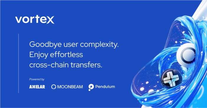
Vortex is a non-custodial platform combining a Forex-optimized decentralized exchange and off-ramping services. It allows users, especially in the Latin American and European markets, to convert between crypto and local fiat currencies using stablecoins like EURC and USDC with very low fees, as little as 0.5%, and minimal slippage. Funds can then be transferred directly to bank accounts. Originally launched under the Pendulum umbrella at SatoshiPay, Vortex evolved into an independent product after internal discussions determined it would operate outside the Polkadot system. It was first developed using a pop-up brand and the name PendulumPay, before transitioning into a fully independent concept with its own design system and identity.

Goal
To create a distinct, forward-thinking brand that signals innovation while instilling confidence at every interaction. The design needed to simplify complex flows, emphasize user empowerment, and differentiate Vortex from both centralized exchanges and other Web3 products. A bold, modern aesthetic combined with transparent messaging allowed Vortex to feel both cutting-edge and reliable.
Challenge
Vortex seeks to solve a layered problem: enable instant, low-cost stablecoin off-ramps while navigating complex global regulations. Traditional off-ramping involves high fees, multiple intermediaries, and custody risks. Vortex’s non-custodial approach demanded a design that instantly communicates control, security and simplicity.
A NEW PRODUCT
Ideation
At Pendulum, within SatoshiPay, the newly formed Business Development team identified a compelling use case in emerging markets. Freelancers paid in crypto were facing significant challenges and high fees when converting stablecoins into their local currencies. To address this, they developed PendulumPay, initially conceived as part of the Pendulum ecosystem. This cross-currency fiat gateway offers on-chain foreign exchange services at interbank rates, delivering key benefits such as up to 85% lower costs compared to traditional methods, instant settlements with transparent fees, and a simplified user experience. It also includes API integration for businesses.
PendulumPay utilizes an oracle-guided AMM to enable minimal slippage FX swaps, bypassing the need for costly USD ramps. The solution focused on underserved regions like Latin America and Africa while targeting high-volume corridors such as Japan and Europe. It addressed a rapidly growing market, projected to reach $137 billion in cross-border stablecoin payment volume by 2028.
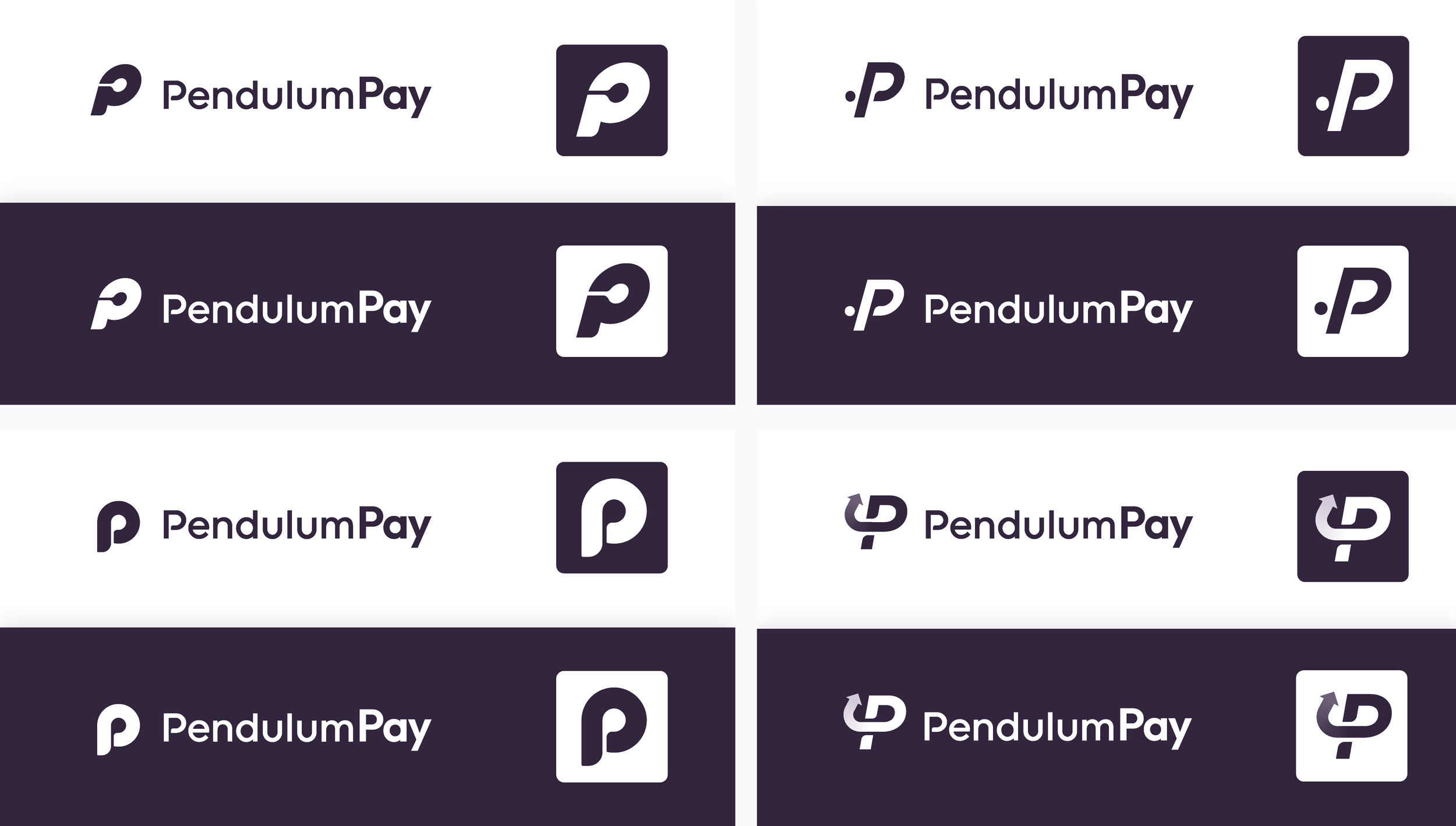
As the Brand Designer at Pendulum and SatoshiPay, I created a pop-up brand tailored to attract investors, enabling the development of a compelling pitch deck to secure funding quickly. With tight deadlines, I conducted rapid research and designed the PendulumPay logo within the framework of the Pendulum brand. I quickly assembled a styleboard featuring similar brands to serve as inspiration for both form and concept. After sharing it with the team, I began developing various concepts for the PendulumPay logo.
This exercise delivered 4 logo alternatives, none of which ended up being used, despide having clear preferences. This was due to the question if PendulumPay was the right name for a product that would have little to do with Pendulum and its ecosystem. We were also not targeting the Polkadot ecosystem, of which Pendulum is part as a parachain. PendulumPay aimed at a broader audience, and in subsequent meetings it was decided that it would run with its own brand, which had to be different from Pendulum.
Naming workshop
We needed a new name. I proposed a naming workshop as we had done before in the context of Pendulum. In this workshop, I follow the naming process of Studio Nom-Nam’s Xavier Grau Castelló, a naming specialist, consisting of five steps:
Focus: Begin by thoroughly understanding the brand’s objectives, target audience, and core values. This foundational step ensures that the naming process aligns with the brand’s identity and strategic goals.
Information Gathering: Conduct comprehensive research into industry trends, competitor names, and cultural nuances. This step provides critical insights that inform the naming strategy and help in crafting distinctive and relevant names. The author also names this step name hunting.
Generation of Ideas: Engage in creative brainstorming to produce a diverse array of potential names. This phase encourages exploring various linguistic styles, word combinations, and inventive approaches to develop a robust list of options. This step leads to generating a long list of at least 100 names.
Decision Making: Evaluate the generated names to refine this selection into a “short list” by assessing each name’s relevance, memorability, and alignment with the brand’s essence. This step may involve preliminary checks for domain availability and potential trademark conflicts.
Presentation: Prepare and deliver a compelling presentation of the shortlisted names to stakeholders. This involves articulating the rationale behind each choice, demonstrating how they fulfill the brand’s objectives, and addressing any potential concerns.
To ensure the process was collaborative and effective, I informed all team members about the upcoming naming workshop and assigned them the first two steps: focusing on understanding the brand by reviewing its goals and identity, and hunting for potential names over the course of a week. Each member was tasked with bringing at least five name ideas to the workshop.
The primary rule during this phase was to avoid judging or evaluating any names, as our focus was solely on generating a comprehensive long list of 100 potential names. During the workshop, team members shared their ideas, contributing significantly to the list. We completed the process with a live brainstorming session, adding the remaining names during the meeting.
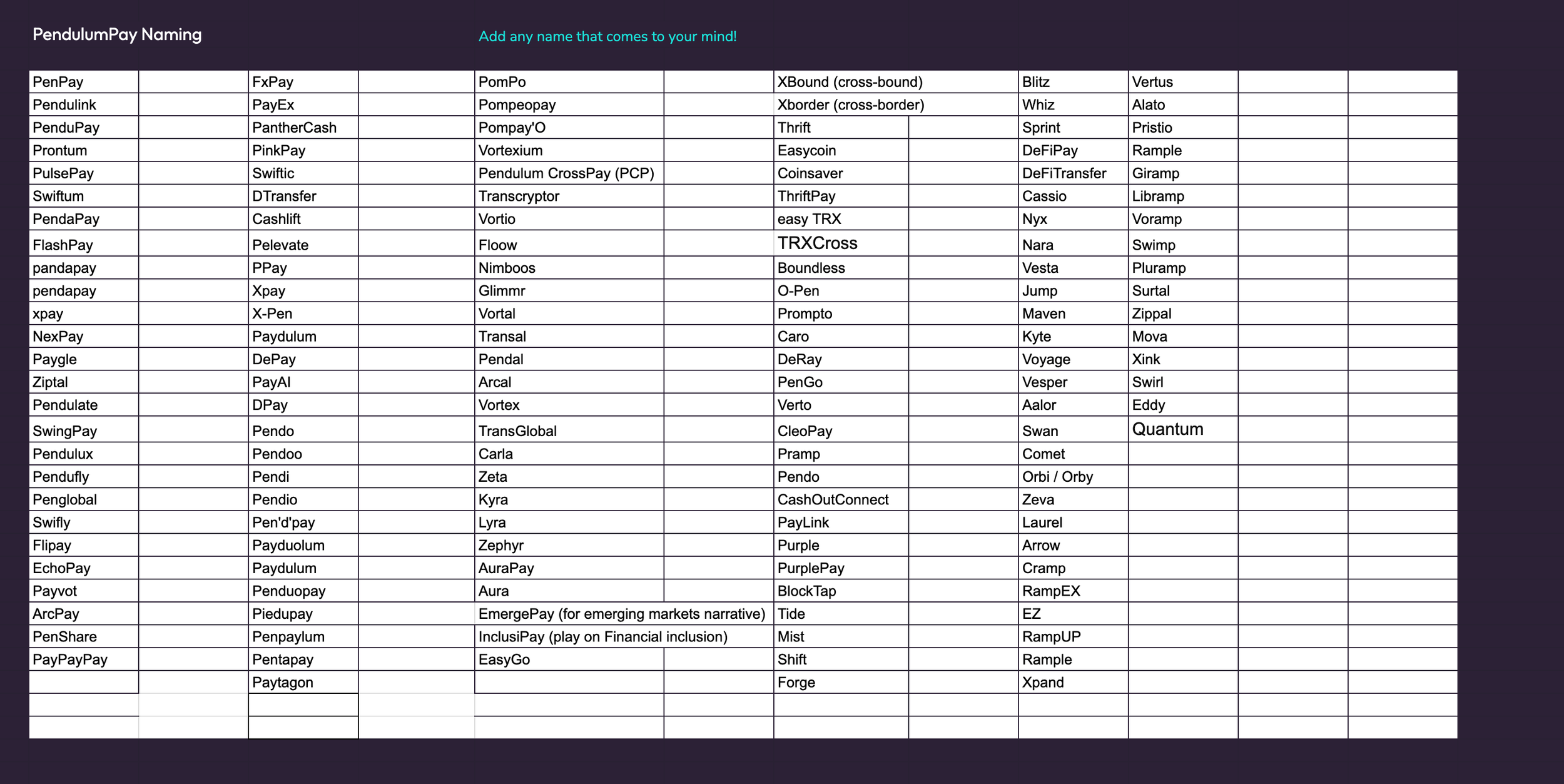
After generating a total of 149 names, the next phase of the task was handed over to the Marketing team, including myself. We selected our favorites by focusing on the names that truly stand out. This refined shortlist was then evaluated against seven key parameters:
Memorability: Refers to how easily a name is remembered. A memorable name creates a lasting impression and ensures customers can recall it when needed.
Simplicity: Ensures the name is straightforward, easy to spell, pronounce, and understand. Simplicity reduces confusion and enhances usability across languages and platforms.
Relevance: Indicates how well the name aligns with the brand’s values, target audience, and industry. A relevant name conveys meaning and establishes a clear connection with the brand’s purpose.
Distinctiveness: Measures how unique the name is compared to competitors. A distinctive name helps a brand stand out in a crowded market.
Legal Availability: Ensures the name can be trademarked and that domains or social media handles are not already taken. This avoids legal disputes and ensures exclusive usage rights.
Cultural Sensitivity: Verifies that the name is appropriate across different cultures and languages, avoiding unintended negative connotations or offensive meanings.
Euphony: Refers to the name’s pleasantness when spoken. A name with good euphony sounds appealing and resonates well with the audience.
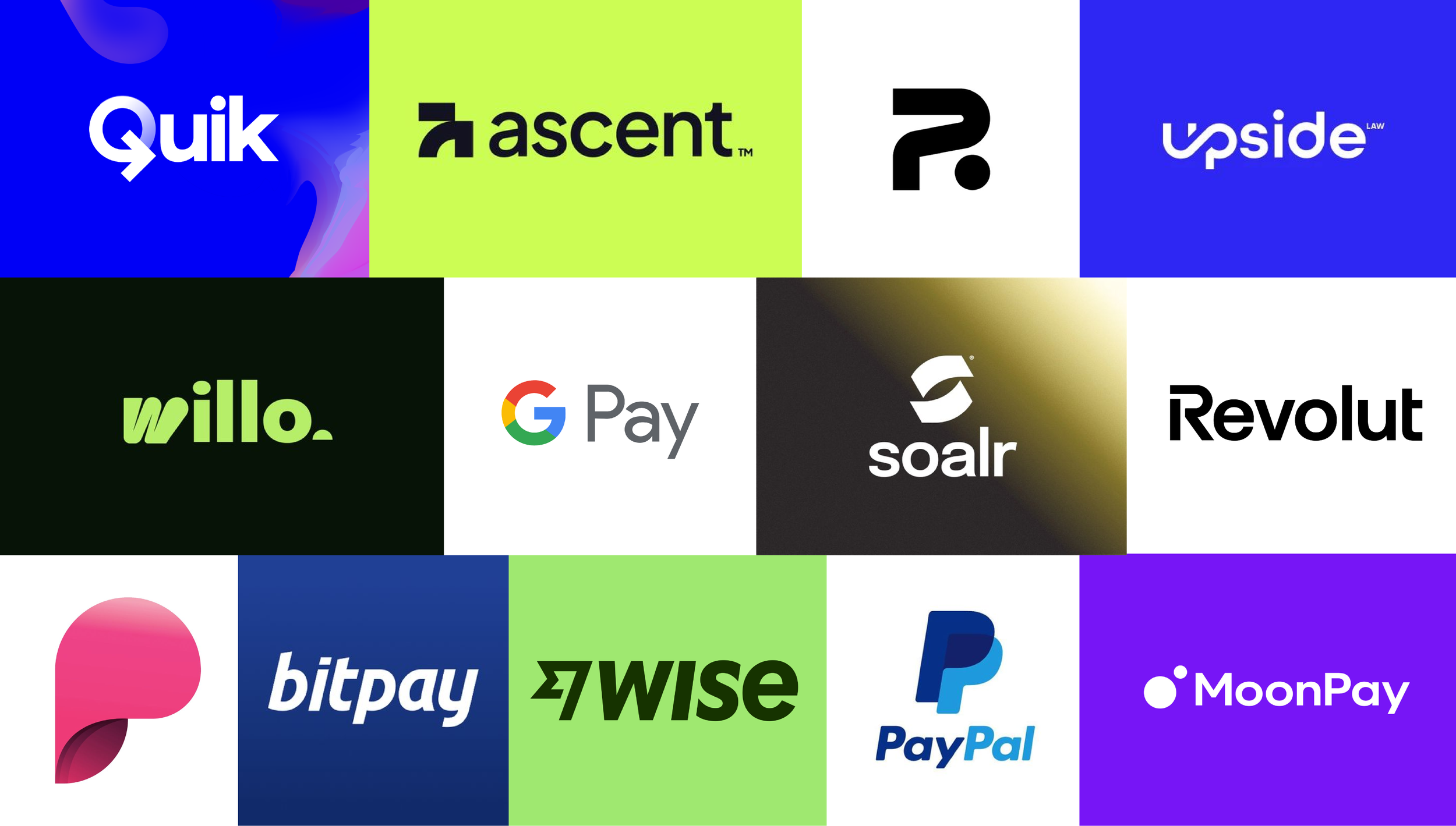
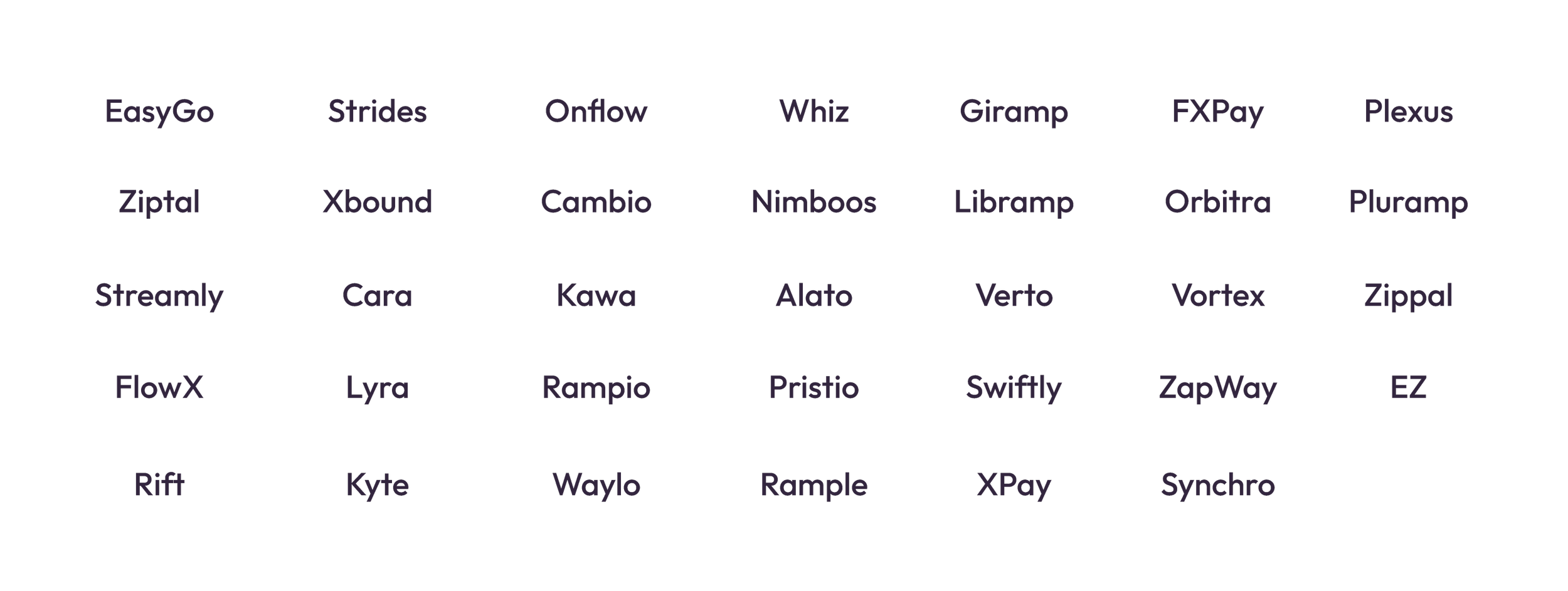
We compiled a list of 34 shortlisted names in a dedicated sheet. The selected names were the following:
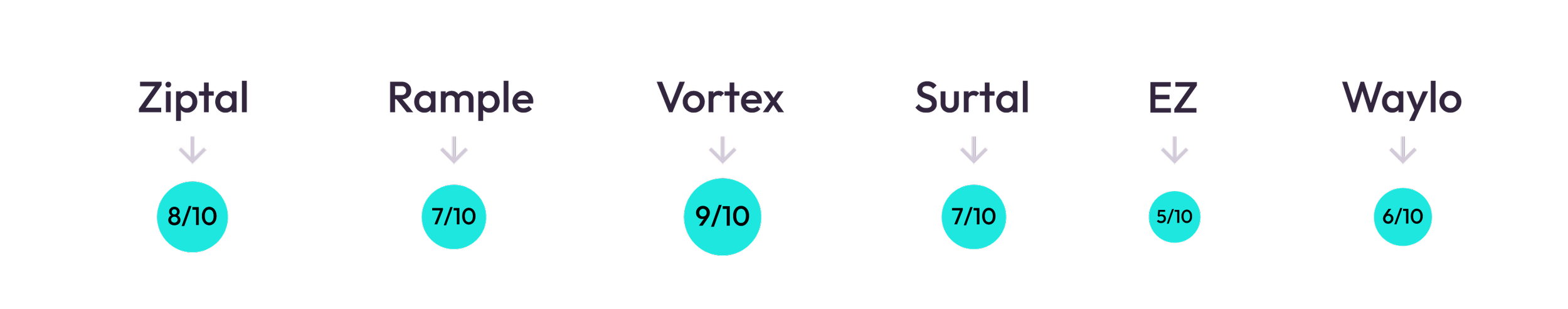
We began by dividing the list among all members of the Marketing team. Names that met key criteria such as legal availability, relevance, and cultural sensitivity were advanced to a final shortlist of six. These names were then evaluated against all the parameters outlined earlier, using a scale from 1 to 10. The results were as follows:
Vortex received the highest score and was unanimously approved by the team leads and co-founders. With the decision finalized, I began developing the Vortex pop-up brand. From previous experiences, I knew that it was highly possible that this brand would become the final one, so I decided to put more thought into it while designing it with tight time constraints. An important detail is that during the process, the team’s favorite option was XPay. It turned out that it wasn’t the best alternative due to legal availability and didn’t score high in other parameters, but understanding that preference, I worked on using the X in Vortex as the main design element.
Branding
I started building the brand first by defining key concepts along with the team:
Innovation:
Cutting-edge blockchain technology and forward-thinking solutions reflect the brand’s focus on progress and creativity.Efficiency:
Streamlined operations and instant settlements emphasize the importance of speed, simplicity, and reduced friction.Transparency:
The brand is rooted in trust and openness, focusing on clear processes, transparent fees, and tamper-proof transactions.Global Accessibility:
A commitment to serving diverse markets and enabling cross-border connections highlights inclusivity and universality.Empowerment:
The brand empowers users by providing tools and solutions that offer control, confidence, and opportunities.
Colors
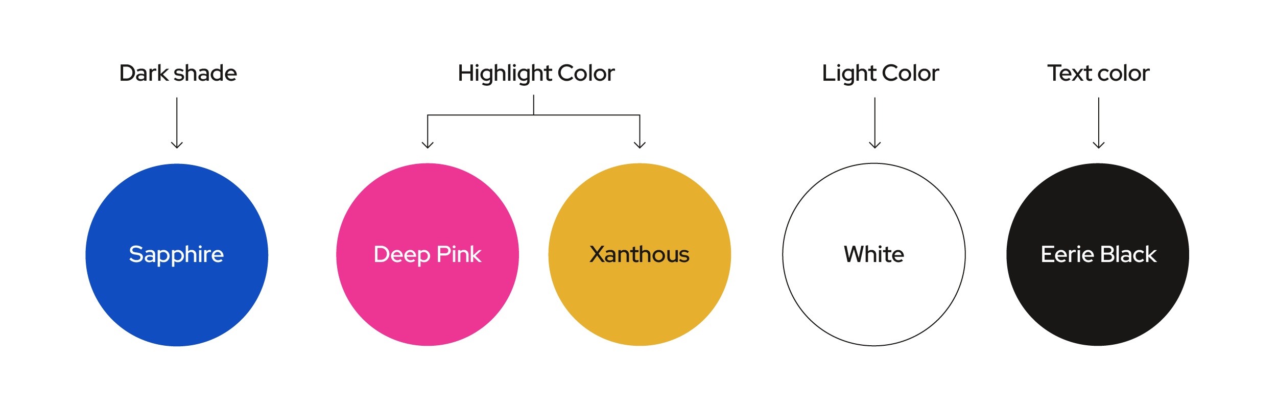
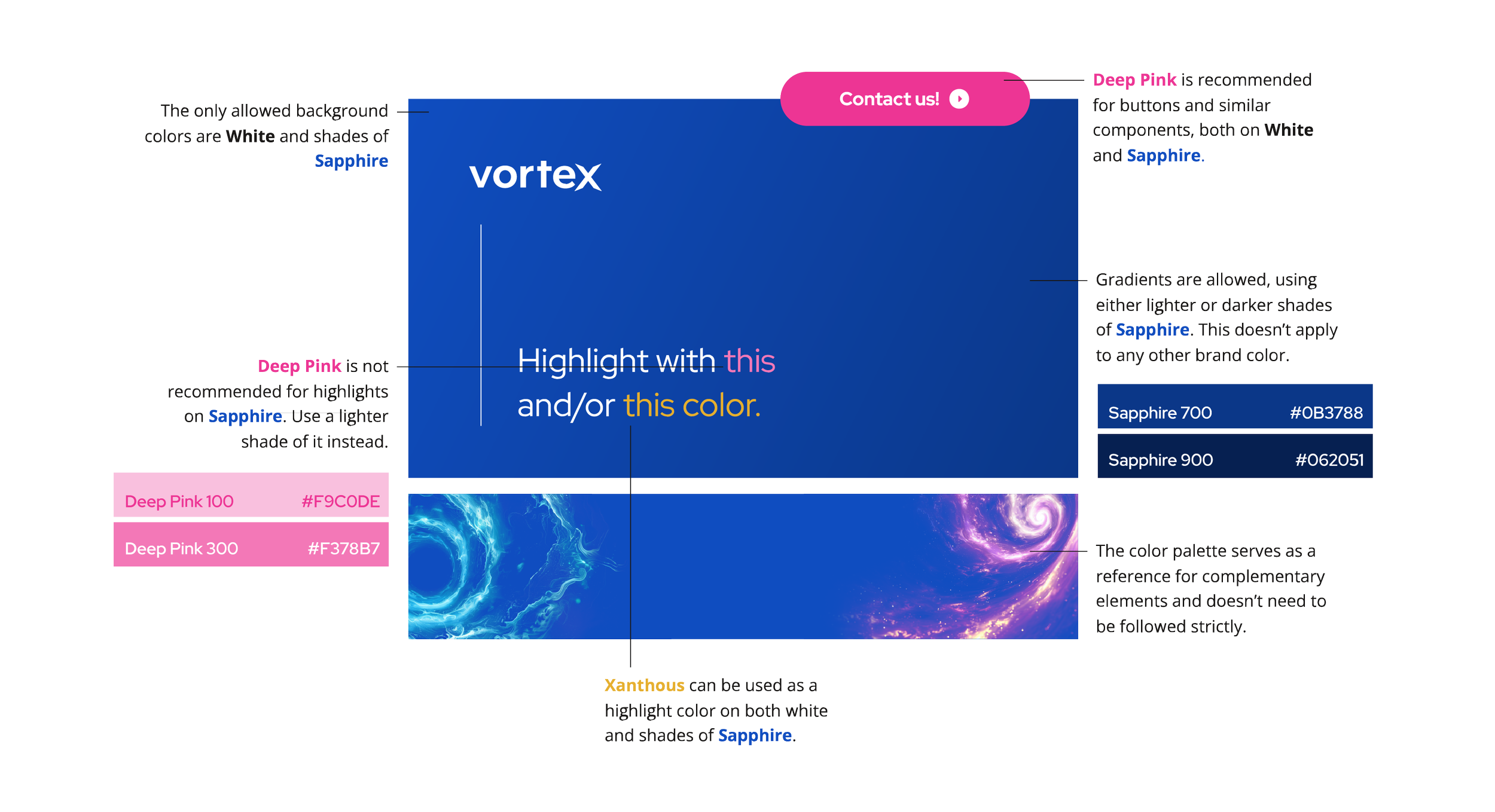
Building on the approach used for the Pendulum brand, the Vortex color palette also incorporates a triad: a dark shade, a light tone for backgrounds, and a neon-inspired accent color to evoke a futuristic aesthetic. During early brand iterations, the bright accent color was split into two variations to better suit practical applications. In Vortex, the colors are intentionally vibrant to emphasize the brand’s bright and futuristic identity, but their use should be carefully balanced to maintain clarity and avoid overwhelming the design. We use Sapphire, a blue tone originally featured in one of SatoshiPay’s early projects, DTransfer, a blockchain solution aimed at enabling instant, transparent, and cost-effective cross-border business payments. Vortex also carries over Deep Pink from DTransfer while introducing Xanthous for added vibrancy. For text, we use Eerie Black, consistent with Amplitude, Pendulum’s sister network.
USE OF COLORS
Lighter and darker variations of the primary colors were carefully chosen to enhance contrast and ensure optimal readability across various applications. These shades provide flexibility in design, allowing for dynamic compositions while maintaining clarity and cohesion. Read more about this in the Design System section.
Typography
The typographic approach draws inspiration from Pendulum’s brand, utilizing a display typeface for headlines and large-format text alongside a complementary font for body text. For the display typeface, I chose Red Hat Display, a sans-serif typeface designed by Jeremy Mickel for the Red Hat foundry. This typeface, part of a larger family, embodies Red Hat’s focus on open-source software and innovation. Its bold, geometric style, with strong contrasts and clear letterforms, makes it ideal for headlines and display use.
For body text, I selected Open Sans, a humanist sans-serif typeface designed by Steve Matteson for Ascender Corporation. Its clean, modern design ensures readability and pairs well with the display typeface. Additionally, we incorporated Red Hat Mono, a monospaced typeface, to showcase code effectively and maintain consistency with the broader typographic system.
Complementary Graphics
Given the tight time constraints in which the Vortex brand was developed, most complementary graphics were developed by using AI, specifically Midjourney and Photoshop edition. In order to get images that adhere to the Vortex brand, we use this prompting guide:
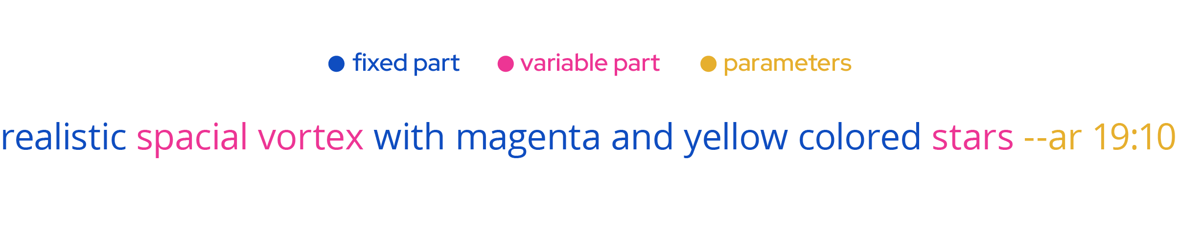
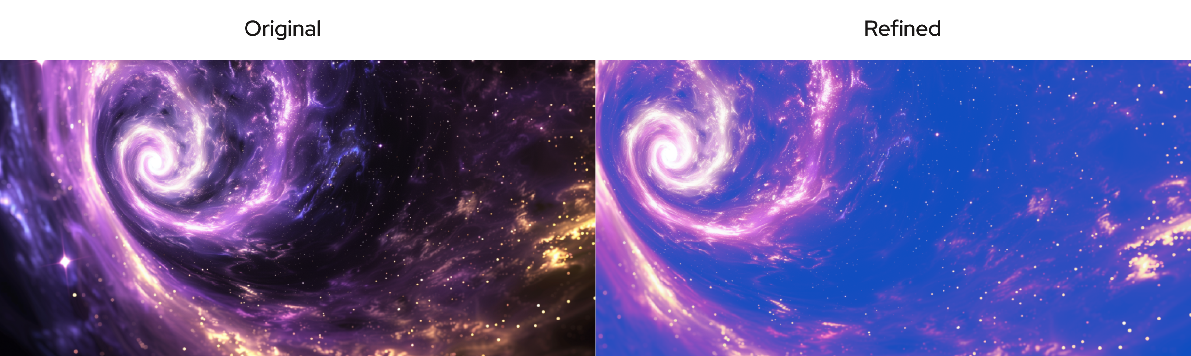
The variable section is editable, while the fixed section ensures consistency and adherence to the brand guidelines. Parameters can be adjusted based on specific requirements, except for --quality. Adjustments should be made carefully, as some parameters may produce experimental or unpredictable results. To ensure the generated image aligns with brand guidelines, maintaining the prompt structure is essential. Once the image is generated, it undergoes a refinement process in Adobe Photoshop to achieve a polished result.
USE OF STYLE REFERENCE PARAMETERS
The --sref parameter was introduced in Midjourney Version 6, released in February 2024, just when we were developing the Vortex Brand. This feature allows users to incorporate specific visual aesthetics from reference images into their AI-generated creations. By appending --sref followed by the URL of a reference image to a prompt, users can guide Midjourney to emulate elements such as color palettes, lighting, textures, and overall ambiance from the provided image. This functionality enhances the stylistic coherence of generated outputs, offering greater creative control and consistency.
At Vortex, we introduced the use of --sref to elevate the brand’s graphics and distinguish them from Pendulum’s visual identity. By leveraging a specific style reference, we generated 3D-inspired images that added a fresh, dynamic look and feel to the Vortex brand.
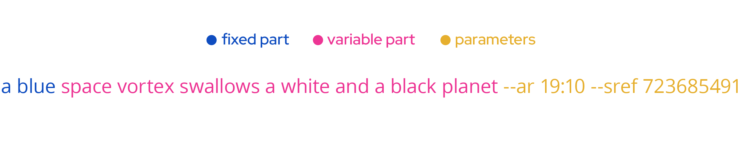
As before, the variable section remains editable, while the fixed part is minimal and specifies only the color. The image generation is primarily guided by the –sref parameter 723685491, ensuring the output aligns with the desired style.
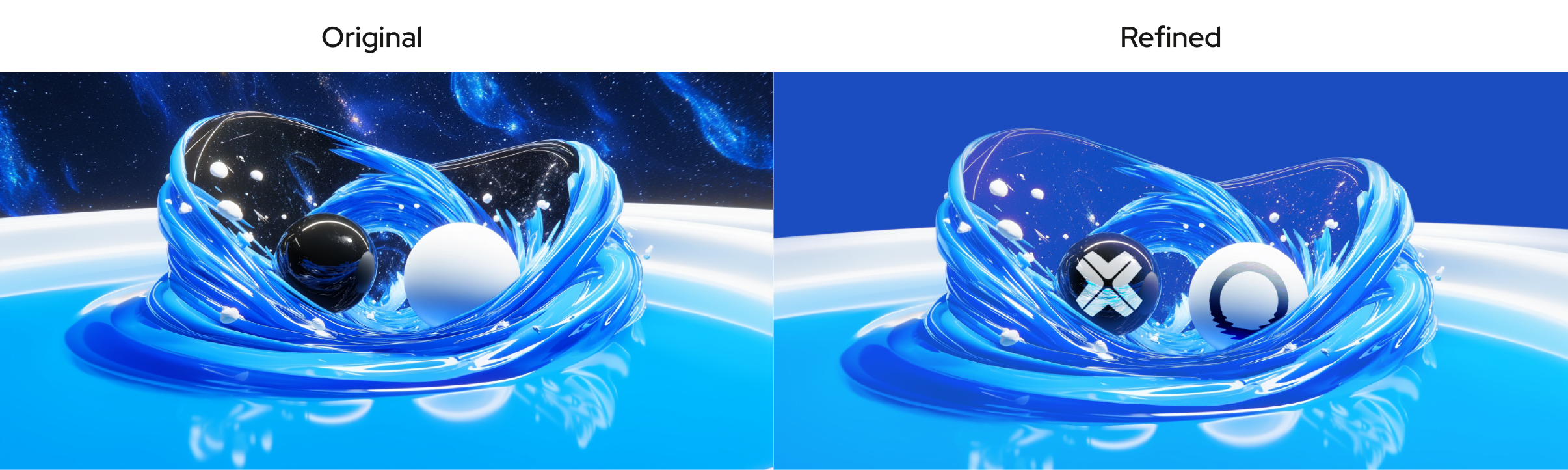
This particular image was intentionally created to incorporate logotypes, showcasing a creative application of Midjourney’s capabilities. Since the tool does not handle text or logos effectively, those elements are added during the editing phase. In context, the final composition enhances the brand’s identity and elevates its visual appeal.
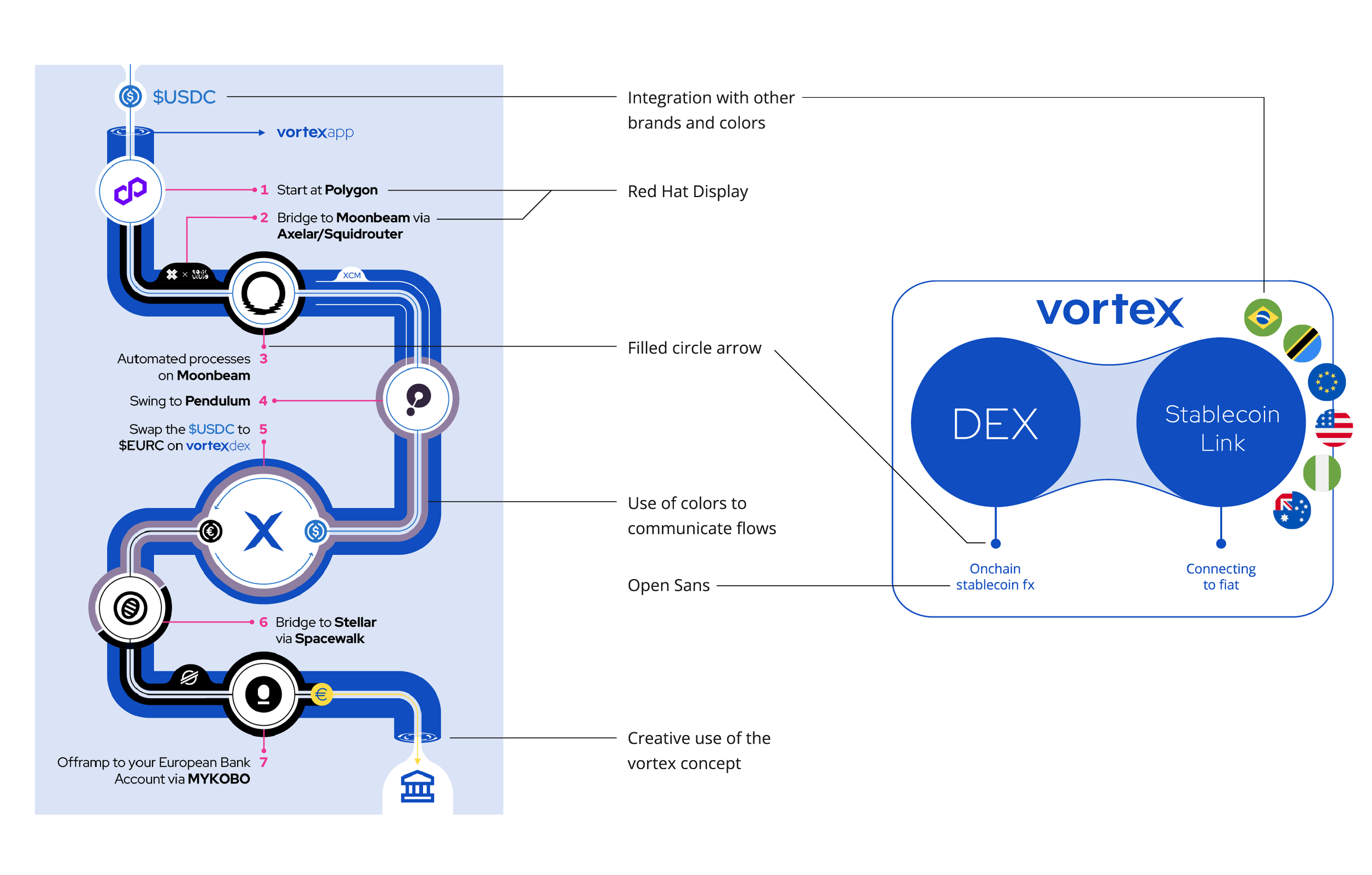
Infographic Style
Infographics play a key role in communicating Vortex’s purpose to users, investors, and other stakeholders. From the start, we developed a distinctive infographic style guided by the Vortex brand identity. Our approach emphasizes versatility, allowing seamless integration of third-party projects and diverse workflows.
Vortex Landing Page
The first major design task for Vortex was creating a landing page. Initially, this served as a simplified website while the tech and product teams developed the actual solution. Its primary purpose was to collect waitlist sign-ups and provide an overview of our offering. Over time, the landing page expanded and evolved into a more comprehensive website.
To enhance engagement and memorability, I designed an animation that added dynamism while showcasing the user interface being developed by the team. The page also includes an infographic to visually explain how the solution works. Key calls-to-action (CTAs) are strategically placed, including options like “Invest” for potential investors, “Launch App” for users, and “Contact Us” or “Support” for community inquiries or technical assistance.
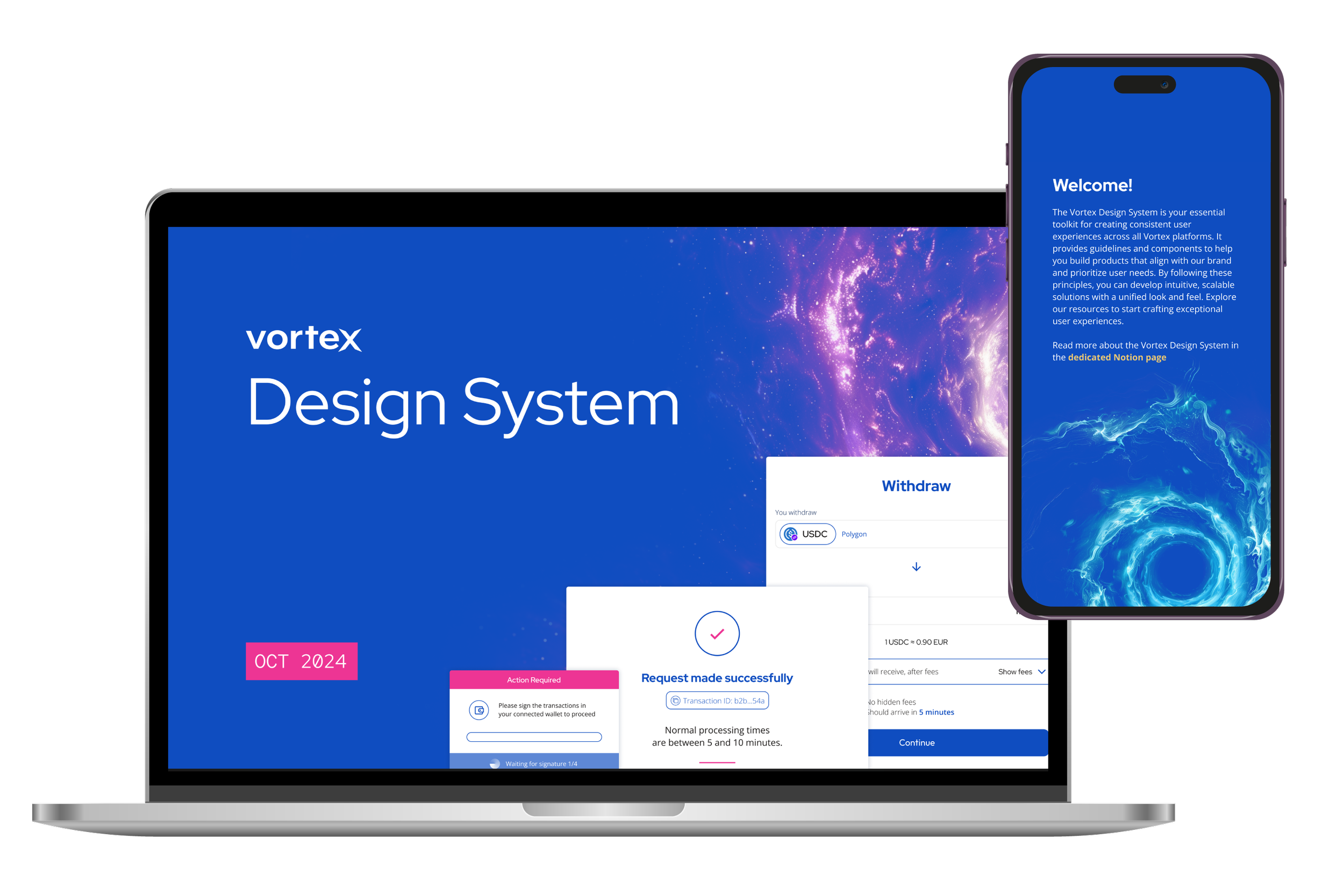
Vortex Design System
Designing the Vortex user interface became essential after the Tech team developed the solution as a fully functional off-ramping platform without a user-friendly interface. Initially, the only way to interact with the system was through code, highlighting the need for an accessible UI.
This effort involved close collaboration between the Tech, Product, and Marketing teams. To kick off the process, I created wireframes based on detailed input from the Product team. These served as a foundation for iterative discussions, ensuring the design aligned with both technical capabilities and user needs before advancing to the next stages.
THE DESIGN SYSTEM
Through these discussions, it became clear that a structured design system, similar to the one developed for Pendulum, was essential. Such a system would allow for greater flexibility in designing interfaces, incorporating user feedback from the Product team, and iterating efficiently.
To address this need, I began developing the Vortex design system. The goal was to gradually integrate new components while streamlining the evolution of the wireframes into their final versions. This approach ensured that feedback from various stakeholders could be effectively incorporated, making the design process faster and more adaptable.
COLORS
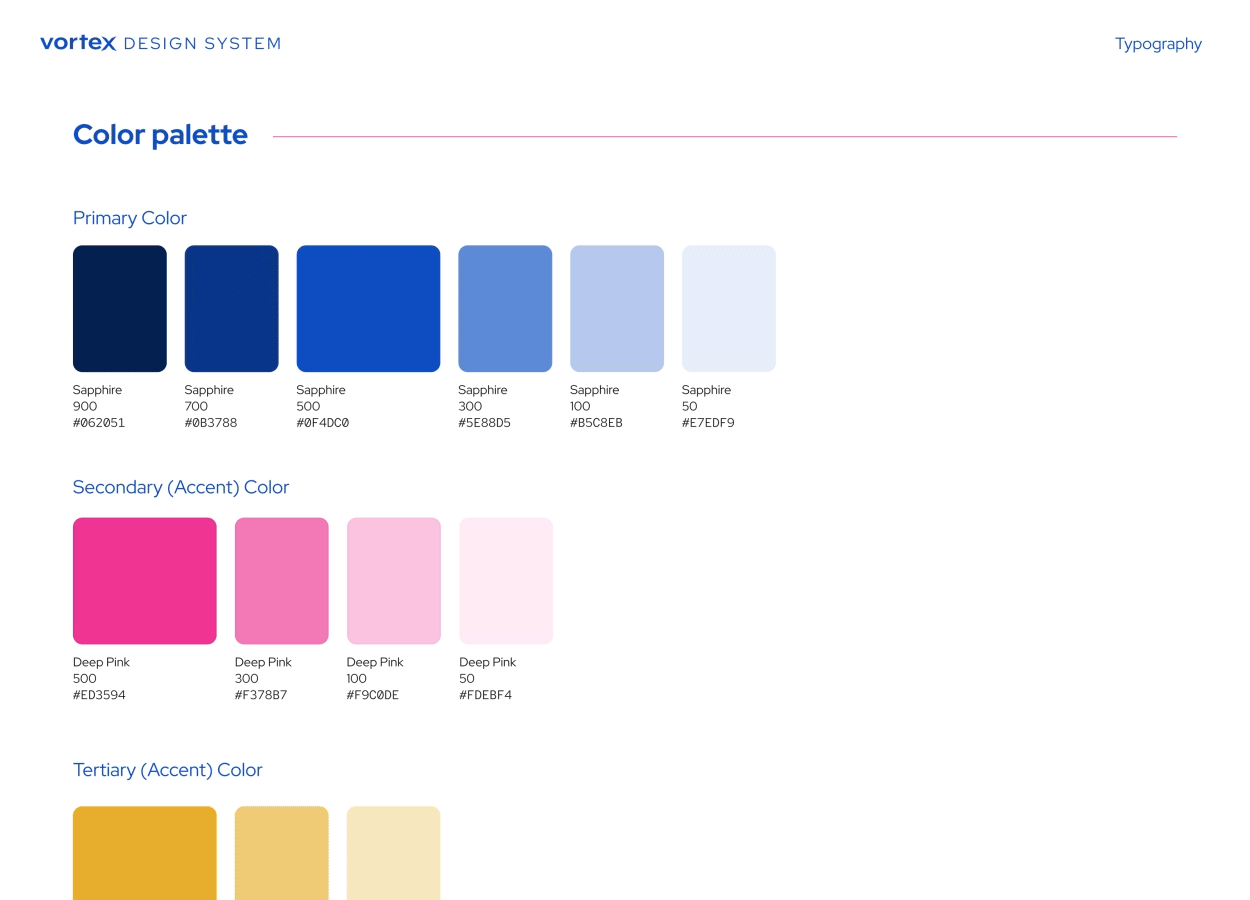
The color palette builds on the brand guidelines, drawing inspiration from Google Material Design’s Color System. Each color features a range of shades, from light (50) to dark (900), enabling the creation of depth and emphasis for elements like hover states, shadows, and backgrounds.
Primary Color: Sapphire 500, complemented by darker shades (700, 900) and lighter shades (300, 100, 50) for added versatility.
Secondary Color (Accent): Deep Pink 500, with lighter shades (300, 100, 50) to support various design needs.
Tertiary Color (Accent): Xanthous 500, used for highlights and with lighter shades (300, 100) for different purposes.
Text Color: Eerie Black 500, with lighter shades (300, 100) for versatility.
Alert Color: Vermillion 500, introduced in the design system to inform the user about potentially dangerous actions.
TYPOGRAPHY
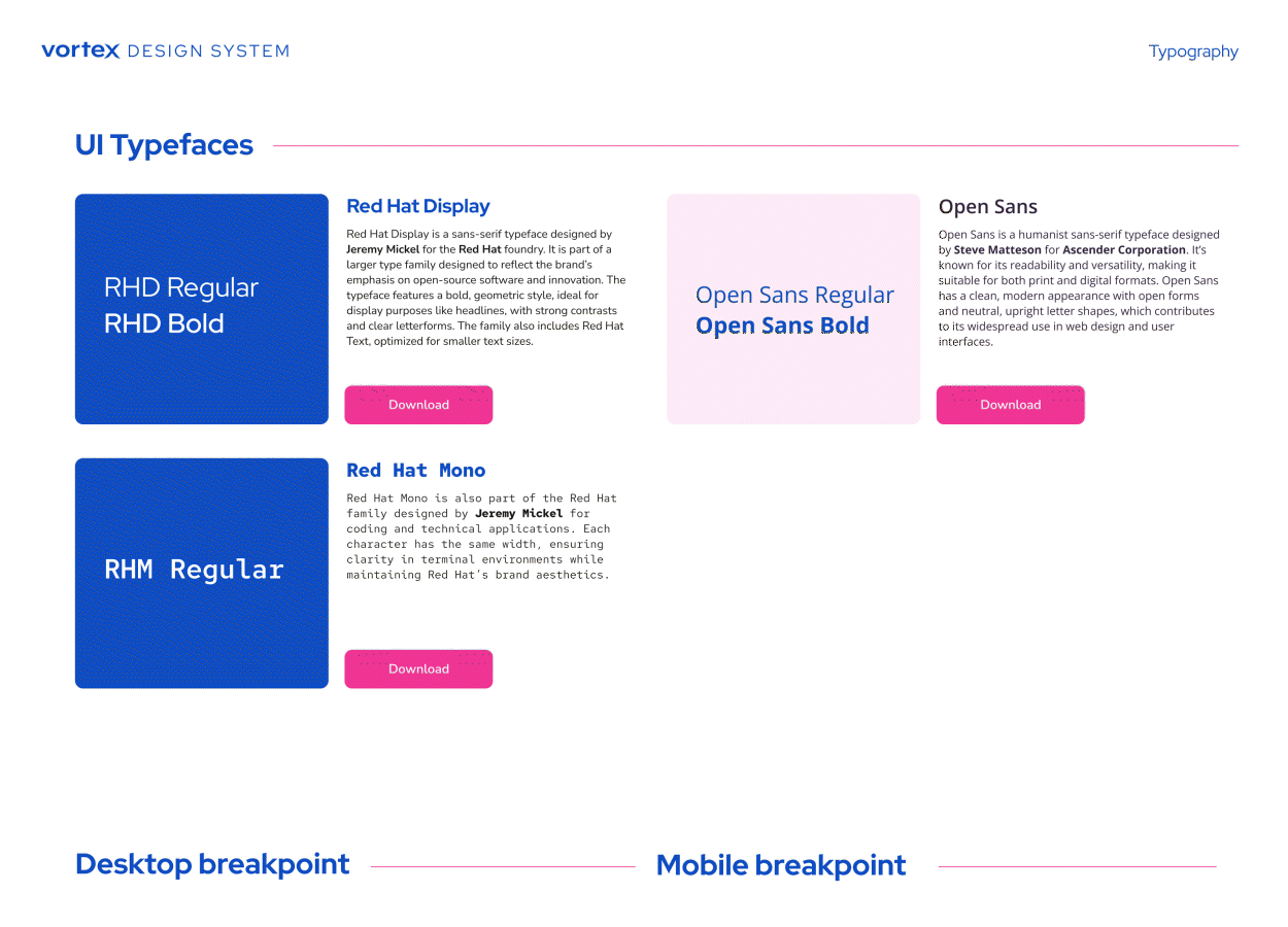
Headings: Red Hat Display is used in three sizes: 36 pt, 24 pt, and 18 pt.
Subtitles: Red Hat Display is also used for subtitles at 24 pt with 15% letter spacing.
Body Text: Open Sans is used for body text in three sizes: 18 pt, 16 pt, and 12 pt.
Code: Red Hat Mono is used for code in three sizes: 18 pt, 16 pt and 12 pt.
For mobile, we use slightly smaller headlines and larger body sizes for better readability:
Headings: Red Hat Display is used in three sizes: 32 pt, 24 pt, and 20 pt.
Subtitles: Red Hat Display is also used for subtitles at 22 pt with 15% letter spacing.
Body Text: Open Sans is used for body text in three sizes: 20 pt, 18 pt, and 14 pt.
Code: Red Hat Mono is used for code in three sizes: 20 pt, 18 pt and 14 pt.
ICONS
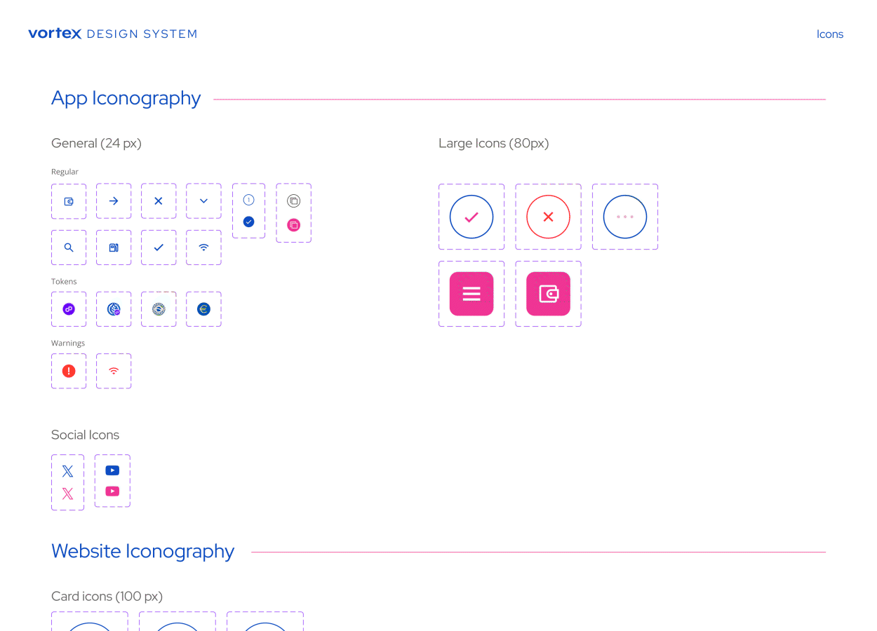
Icons are available in three formats, designed to improve user experience and streamline interface navigation:
General Icons (24 px): These icons enhance usability by guiding users through the interface. Inspired by Pendulum’s design, they incorporate a mix of filled and outlined styles for added versatility and scalability.
Large Icons (80 px): Tailored for key interactions and mobile menu items, these icons provide enhanced visibility and focus.
Website Iconography: Interactive icons specifically designed for use on the landing page, ensuring a dynamic and engaging user experience.
TRANSACTIONS
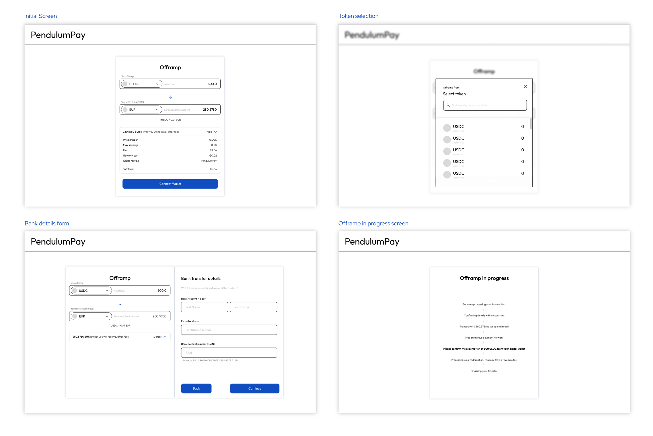
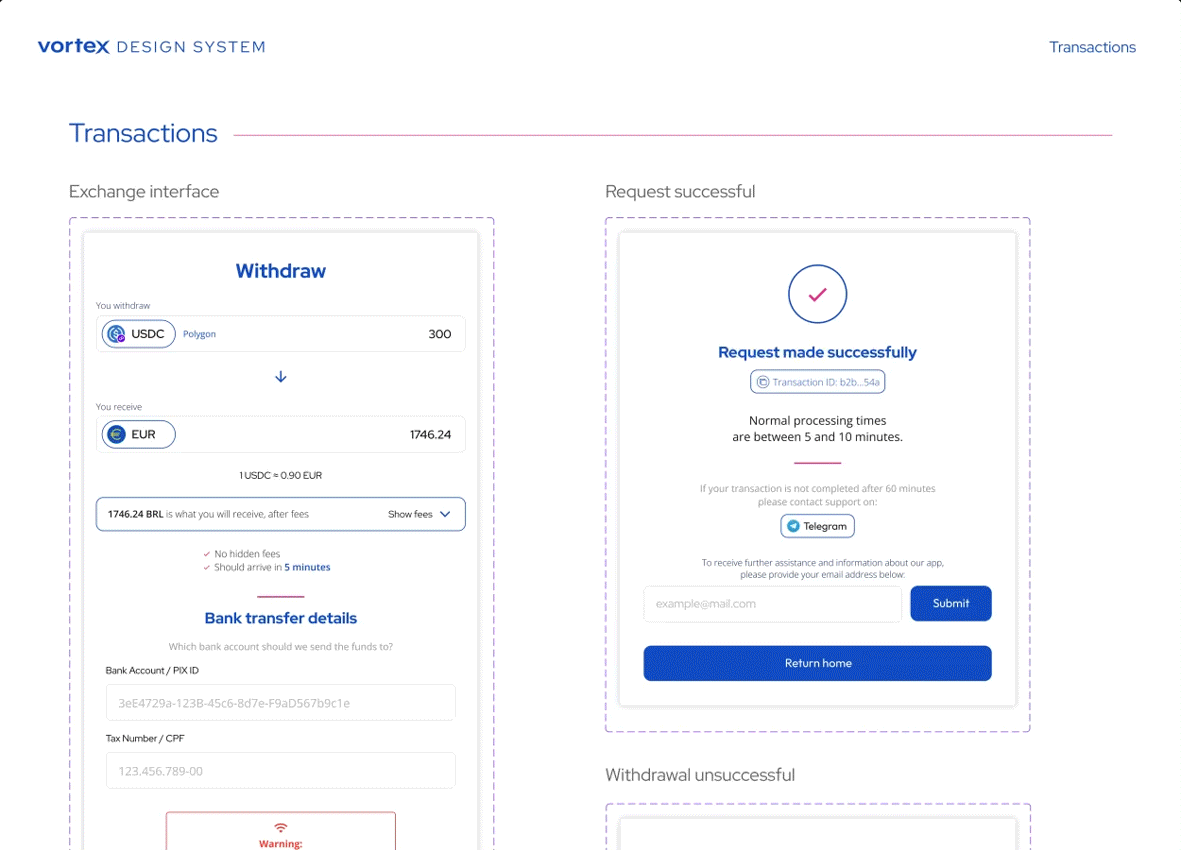
The transaction screens evolved from the initial wireframes to a polished and user-friendly design. The primary testing screen showcases a transaction of USDC on Polygon, with a standard input amount of 300, being off-ramped to EUR. To ensure transparency, the fees dropdown remains initially closed but includes a clear message confirming that there are no hidden fees. Additionally, it states that the transaction is expected to arrive within 5 minutes.
A crucial feature is the warning message displayed above the confirm button. This message emphasizes the importance of a stable internet connection, particularly for users on mobile devices with potentially unreliable data networks. This precaution helps minimize the risk of funds being lost during the transaction process.
The subsequent screens cater to three possible outcomes: successful transfer, unsuccessful transfer, and pending transfer. Each screen prominently displays the transaction ID with a convenient copy option for the user. Additionally, users are provided with a direct link to the Telegram channel to contact the support team.
To enhance communication, we included a field where users can enter their email address. This feature allows us to share updates and provide further information about the app, which is particularly important since the app does not require a login. Users connect their wallets directly, but no additional personal information is collected.
STATUS INDICATORS
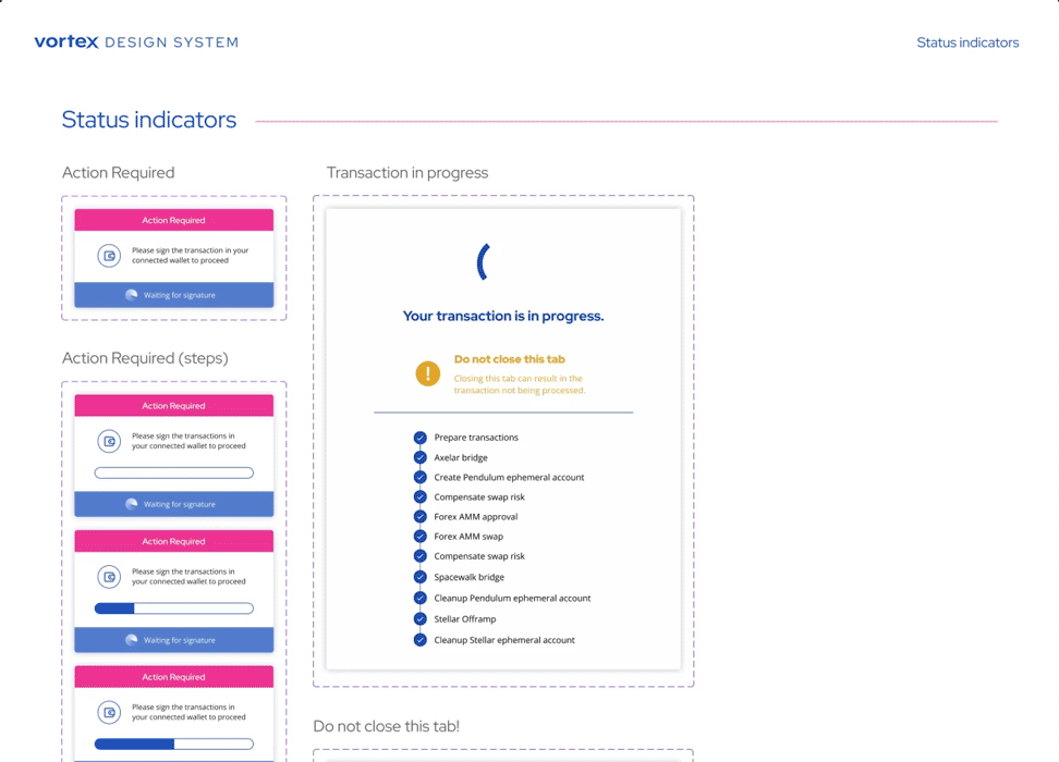
Status indicators play a critical role in the interface, particularly in scenarios where users need to sign transactions in their wallets or wait for processing. To make this process smoother and reduce potential anxiety, we implemented loading bars and step-by-step progress indicators.
These elements aim to maintain transparency, ensuring users are informed throughout the process. Providing clear feedback prevents situations where users might close the interface out of frustration or uncertainty, which could interrupt the transaction and potentially result in lost funds.
Outcome
Vortex was launched at the beginning of 2024, initially in Brazil, and has received praise from users since its release. For years, converting stablecoins into local currency has been slow and expensive. Vortex’s simple tool effectively eliminates these inefficiencies. This proves that even the most intricate technology can feel approachable when design leads with clarity and trust. The service is now expanding its reach to the Eurozone and Argentina, with plans to serve a global audience in the future.
“With Vortex we can offer our clients user friendly and cost-effective gateways into Fiat Currencies.”
“Wow! Vortex Finance is a thing of beauty and only takes a few minutes! Try it out now for yourself. ”