
In a nutshell
What is Pendulum?
Pendulum is a blockchain network connecting fiat currencies with DeFi, integrating stablecoins via the Polkadot-compatible Substrate framework. Its ecosystem features the integrated Spacewalk bridge, a tool that lets you move assets securely from the Stellar network to Polkadot, and Amplitude, a sister chain on Kusama used as a testing ground for innovative applications.

What was my role?
I joined the company in 2022 as a Graphic Design Working Student while pursuing my master’s degree, contributing to key design initiatives across the company. This included supporting the development of brand identities for our projects Pendulum, Amplitude, and Spacewalk, creating merchandising assets, and designing marketing materials aligned with strategic goals. I also worked on web and editorial content to strengthen visual communication and conducted market research to inform design improvements and enhance the user experience. Later, as the lead Brand Designer, I took on greater responsibility, collaborating closely with the product, marketing, and operations teams to meet a wide range of design needs. This role involved integrating AI-driven tools to streamline branding processes, boost production efficiency, and maintain consistency across all touchpoints.
FIRST CASE STUDY
Enhancing Pendulum’s Medium Blog
Summary
The Pendulum blog had been running for some years with limited success. In an effort to expand its reach, I was given the challenge of elevating brand consistency and improving its overall structure. By identifying key content categories and proposing a clear visual identity, the goal was to improve navigation and encourage more users to read and engage with the content. Although the proposed improvements were very well received, a full rebranding was later initiated, so this solution was not implemented in its original form.
Goal
Present a new cover image system for the Medium blog that could ease navigation and understanding of the different types of content in it: educational articles, Pendulum news, Amplitude news and partnership announcements.
Challenge
Elevate the visual appeal and consistency of our blog by developing standardized assets, addressing the lack of cohesion resulting from the absence of a dedicated designer prior to my onboarding.
Design audit of current blog

CATEGORY – PENDULUM NEWS
I observed various layouts, including images with and without text, differing alignments, and font sizes.
The Pendulum logo is inconsistently applied, highlighting the need for clear usage guidelines.
Standardizing image dimensions for each platform would ensure the system adapts effectively to their requirements.
CATEGORY – AMPLITUDE NEWS

The images here are more consistent, showcasing two similar design systems with variations in color and font. However, image sizes remain inconsistent and should be standardized.
Additionally, an older post features a preliminary version of the Amplitude logo, which should be updated to the final version to enhance brand consistency.
CATEGORY – PARTNERSHIP ANNOUNCEMENTS
This theme maintains consistent color and design, showcasing two systems: one using icons and colors, and another featuring full logos on a pure black background, each with different canvas sizes.
Merging these into a versatile, clear image that accommodates various logo types (with or without symbols) and includes complementary visual elements would be ideal.
CATEGORY - EDUCATIONAL
This topic offers the most flexibility in design and typography. Many post images lack text, and when text is included, it is center-aligned without a consistent format. Logo sizes, element positioning, and graphic styles also vary significantly.
Research, Moodboard and Styleboard

Comprehensive research was conducted to assess the current state of blog posts and how similar companies communicate. The selected companies stood out for their strong brand image and visually appealing blog post designs. Their images are easy to understand and have a cohesive identity, with notable similarities worth considering.
The moodboard showcases references that capture the desired tone for the proposal. It focuses on conveying the intended mood rather than replicating a specific visual style, as Pendulum and Amplitude should establish their own distinct visual identities instead of imitating others.
Building on the moodboard and brand guidelines, I created a styleboard that incorporates diverse influences to expand the visual approach for blog and social media posts. The focus of this styleboard is on graphic style and layout variations, offering a range of possibilities for visual design rather than emphasizing specific content.
Outcome

This system differentiates post types by color and uses the Lexend (Readex Pro) typeface, consistent with the Pendulum and Amplitude websites, with left-aligned text.
The canvas measures 1200 x 630 px, featuring a 61 px margin and a 123 px bottom band for logos. A header indicates the post type, such as News or About, with a proposed header for educational content.
The background includes dynamic generative artwork with dots and lines, aligning with the current visual identity of the website.
NEWS
ABOUT (Educational)
PARTNERSHIP

Conclusions
The proposed visual system provided a solid foundation for consistent and flexible branding, with room for future growth. Adding secondary fonts and colors would have expanded creative possibilities, while exploring generative art offered opportunities to create dynamic, engaging visuals aligned with the brand. A cohesive set of icons could also have enhanced consistency across platforms. Altogether, these elements were designed to meet current needs and adapt smoothly to future challenges.
Unfortunately, the visual system was not implemented, as Pendulum’s CMO shifted focus toward a complete rebranding. With this change in strategy, the blog’s visual identity was no longer a priority and became obsolete.
SECOND CASE STUDY
Pendulum Rebranding
Summary
While Pendulum’s technical framework was robust, its original branding lacked the depth, cohesion, and visual appeal needed to connect with its diverse audience. In collaboration with Wirelab, a renowned branding agency, the rebranding project aimed to resolve these gaps and create a cohesive identity that encapsulated Pendulum’s mission and values.
As a working student graphic designer, I joined the rebranding efforts during this transformative phase, working hand in hand with the external Wirelab team. My contributions played a key role in shaping the brand’s visual identity, ensuring that the final design aligned with Pendulum’s vision and stood out in the competitive blockchain space.
Goal
Design a visually engaging brand and cohesive design system that clearly reflects Pendulum’s mission to pave the way for a decentralized future, while helping the brand stand out from its competitors.
Challenge
To overcome the main weaknesses of the Pendulum brand, which at the point were:
Lack of Identity: The original logo, color palette, and graphics were too generic to stand out in the competitive blockchain space.
Inconsistent Messaging: Visual elements lacked conceptual cohesion, making it difficult to effectively convey Pendulum’s mission across platforms.
Low Engagement: Limited design adaptability led to low user connection and brand recall.
Scaling Issues: The design system lacked the flexibility to support expanding interfaces across web, mobile, and other platforms.
Previous Pendulum logo and color palette
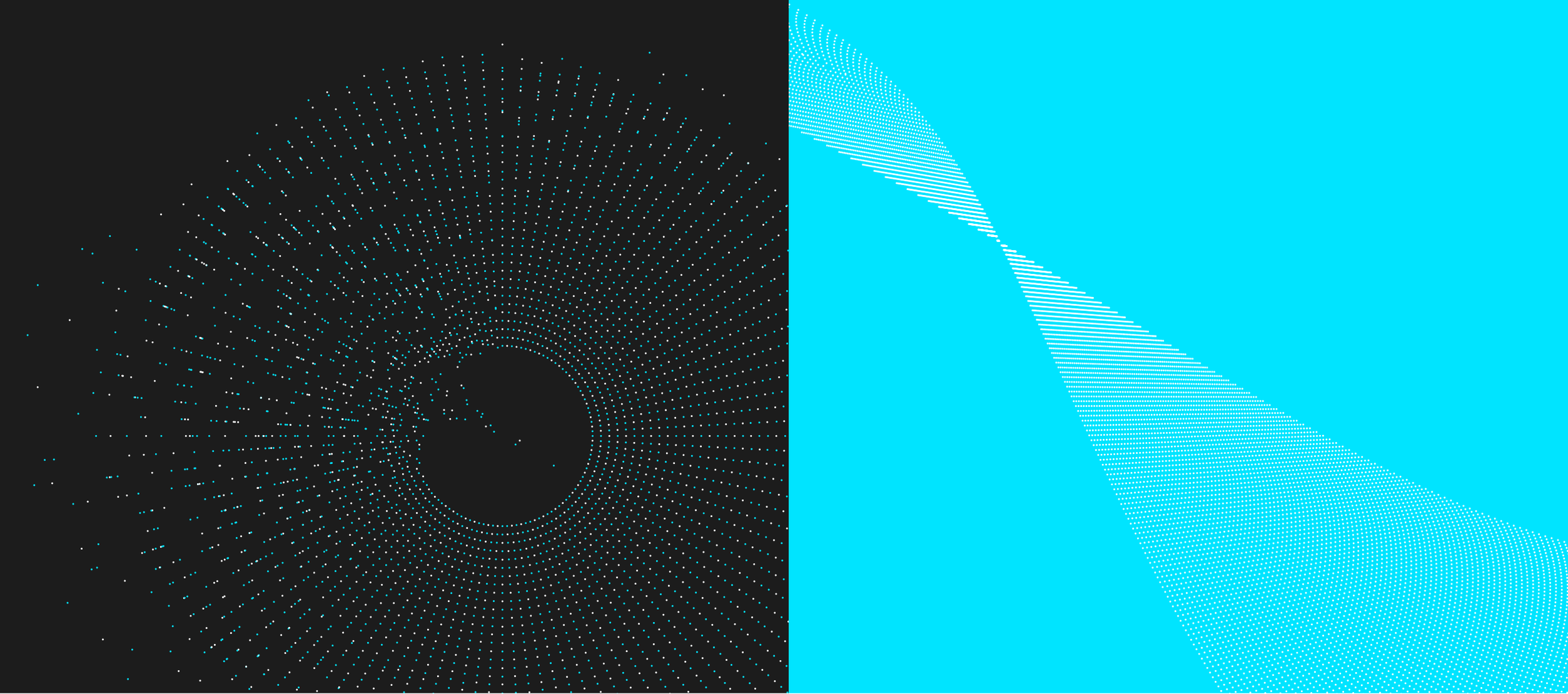
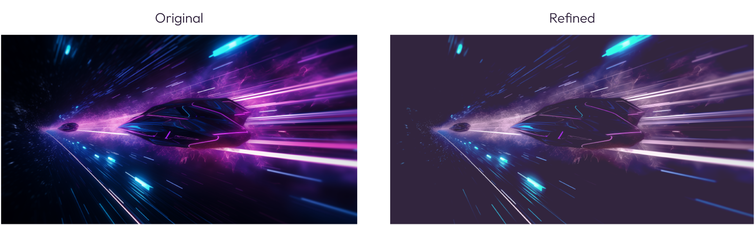
Temporary complementary graphics refinement
The previous Pendulum complementary graphics included dotted images in Electric Blue, lacking clear guidelines. After joining the company, I refined these visuals as a temporary solution, aligning them with the concept of ‘the meeting point’ to highlight Pendulum’s role as the bridge between fiat and DeFi. This refinement incorporated generative art and introduced the theme of ‘order and chaos,’ represented by structured concentric circles transitioning into a dynamic, chaotic flow.
Research and Audit
Our rebranding process began by taking stock of everything we had. Over several weeks, I audited Pendulum’s entire brand environment, encompassing websites, social posts, docs and blog content, giving it a brand health check-up. Simultaneously, we as a team organized an in-depth internal workshop, in which I contributed with instructing the team about branding basics. During that workshop, the Pendulum essence was distilled into three pillars:
Freedom Through Decentralization
A Futuristic Financial Vision
Dynamic Design for Adaptability
Building on that audit and workshop results, I turned to the Pendulum community for feedback. The community, mostly active on X and Twitter, helped confirm the accuracy of the pillars we defined during the workshop. Simultaneously I also analyzed the sentiment about Pendulum on X. About 70% of the comments expressed excitement about Pendulum’s vision, but a sizeable fraction also noted confusion around branding and stablecoins details. Some even asked basic questions like “is Pendulum a coin or a network?”. This taught us that people trusted our technology but were not always clear on our role. This research phase revealed clarity and credibility were top priorities for the new brand.

Affinity diagram capturing insights from both the internal workshop and community feedback.
The community surveys and workshop discussions also showed the idea that Pendulum’s identity should feel trustworthy and futuristic. For example, one internal insight was that finance audiences, like NGOs and regulators, prioritized trust and conservatism, while crypto-savvy users craved a cutting-edge look.
This research drove our and Wirelab’s creative direction and justified upcoming design decisions. It gave everyone in the team confidence that the new colors, logo, and messaging would not just look good, but also resonate with the audience.
Design Process
LOGO REDESIGN
The new logotype was designed to capture the essence of the “pendulum” concept, emphasizing its ability to symbolize the brand’s dual scope of action. This focus was established early in the branding process, ensuring a cohesive result that resonated with both Wirelab and the Pendulum team.
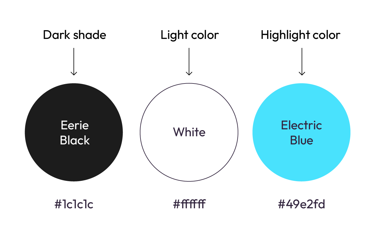
COLORS
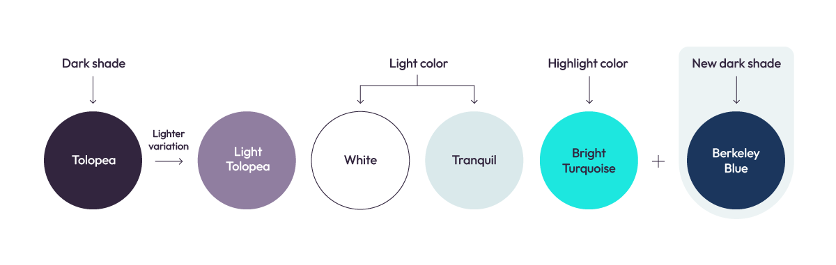
The new color palette was designed to function as a triad: a dark shade, a light tone for backgrounds, and a bright, neon-inspired accent color to convey a futuristic feel. The selected colors adhere to this approach while also introducing variations to enhance the brand’s dynamism.
Some time later, in response to the demands created by the brand’s use in various contexts, a new color, Berkeley Blue, was introduced. This addition diversifies the palette and provides new possibilities for color applications.
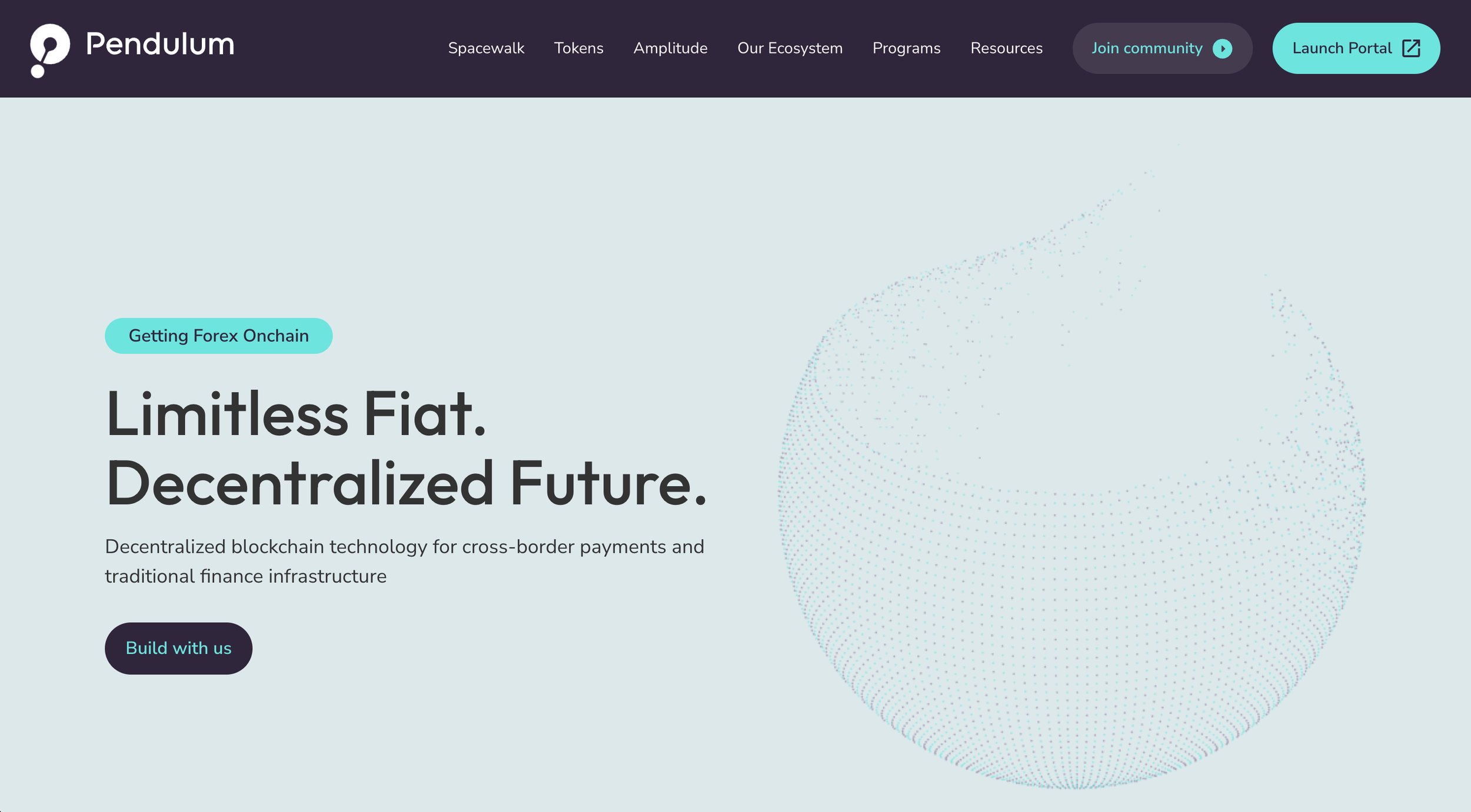
HERO IMAGE
Designing Pendulum’s hero image was one of the most challenging tasks, requiring multiple iterations. The goal was to capture Pendulum’s unique identity (bridging a structured past with an innovative future) within a single image. The process involved carefully balancing disruption, highlighting the underlying structure, and achieving the right density. After extensive exploration, we achieved the ideal composition. This hero image is designed to be used partially within various compositions, rather than centered as shown here. This approach is due to its high level of detail, ensuring it does not overshadow other elements in the design.
Some time later, due to the overuse of the original hero image, I proposed a new version for preferential use on the website. This update aligned with the brand’s evolution and was part of a broader integration of AI into various graphics, which will be showcased in upcoming sections.

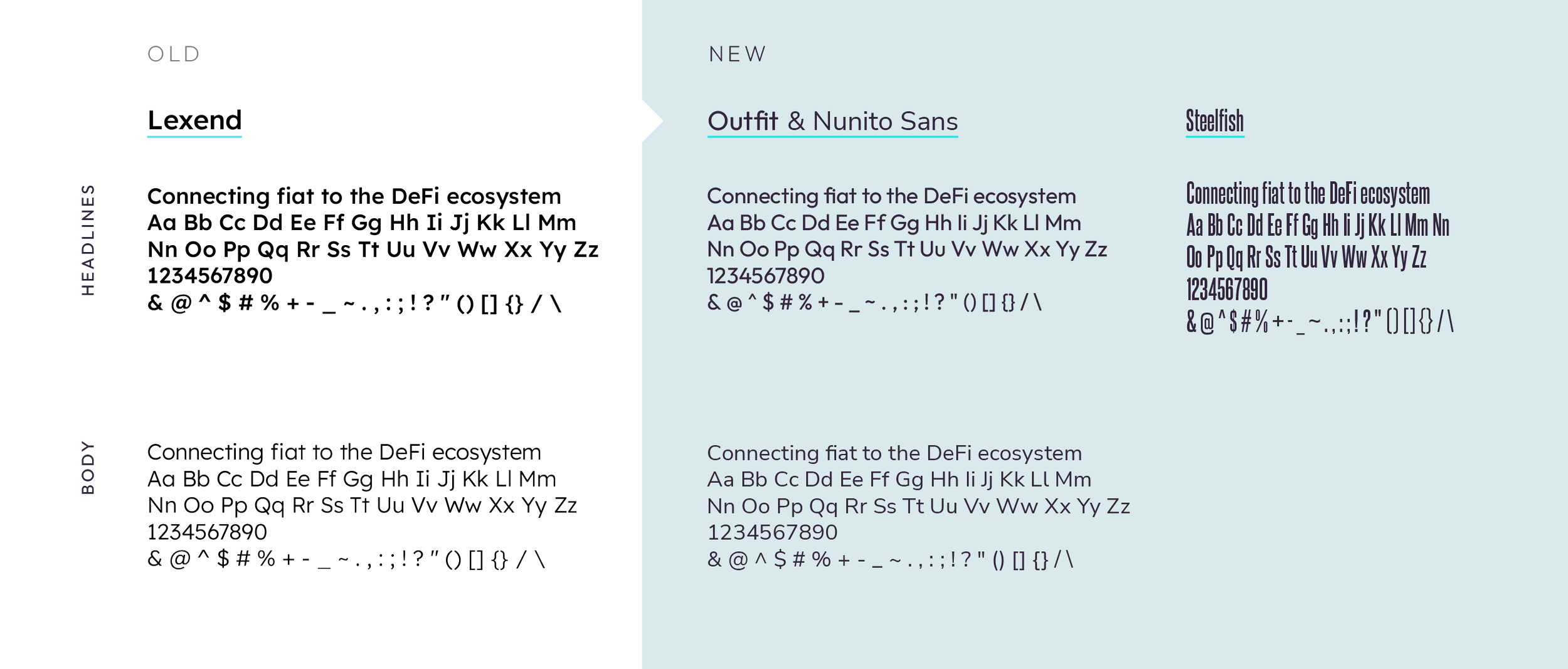
TYPOGRAPHY
Typography is a key element of our brand, directly communicating our message. Several typographic approaches were explored, and we decided on distinct fonts for headlines and body text to ensure readability while maintaining a clean, corporate, and modern feel.
For headlines, we chose Outfit, a geometric sans-serif typeface by Smartsheet Inc. and Rodrigo Fuenzalida, for its neutral design and excellent readability. For body text, we selected Nunito Sans, a well-balanced sans-serif font that complements Outfit and offers exceptional clarity.
After several months, we incorporated a new typeface, Steelfish, into the Pendulum brand. Designed by Typodermic Fonts Inc., this condensed display typeface serves as a headline variant and adds versatility to the brand. It is particularly effective for merchandise designs and more creative compositions.
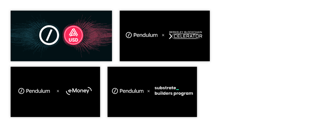
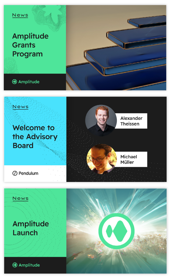
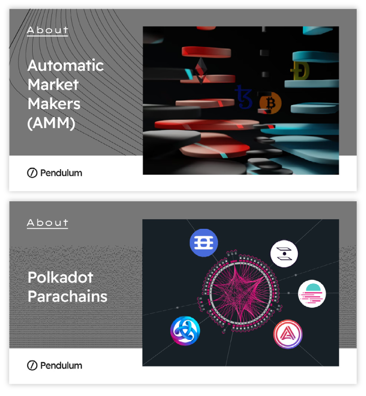
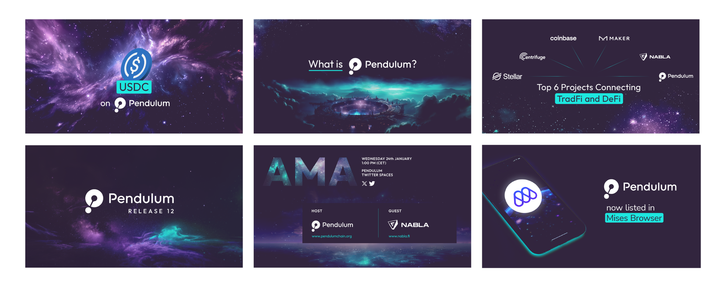
SOCIAL MEDIA ASSETS
The first social media assets created under the new branding were Medium post images. Medium, widely used by Pendulum and other blockchain companies, is an online publishing platform recognized for its clean, minimalist design and focus on readability. To align with this aesthetic, we designed post images that were simple and minimalist, effectively serving as engaging introductions to the content.

The Disruption of AI
CONTEXT
Artificial intelligence (AI) tools like ChatGPT and Midjourney have revolutionized design processes, particularly in branding. Midjourney, an AI-powered image generator launched in 2022, enables designers to quickly create unique visuals and concepts, significantly expanding creative possibilities. Similarly, ChatGPT, introduced by OpenAI in late 2022, supports the creation of brand narratives, slogans, and engaging content, enhancing storytelling in branding.
In developing the Pendulum brand, we integrated these tools thoughtfully, ensuring their use remained subtle and natural. This approach required careful consideration to avoid the overly apparent or forced aesthetic that many companies adopting AI-driven design have unintentionally showcased.
MIDJOURNEY
Midjourney has been a key tool in Pendulum’s branding process, enabling rapid ideation and experimentation while producing images that can be legitimately used for branding purposes. The process involves “prompting,” where carefully crafted textual descriptions guide the AI to generate specific images. To ensure the outputs align with the brand’s identity and maintain visual consistency, the prompting process was refined and documented as an integral part of the branding workflow.
Pendulum has embraced sci-fi-inspired imagery from the start, reflecting its core values of speed, security, accessibility, innovation, openness, decentralization, trust, and inclusion. These themes have been consistently represented in internal discussions, often using visuals of space, such as astronauts and planets, symbolizing the exploratory nature of crypto.
Research on similar brands, like Stellar, Centrifuge, and Astar, revealed a shared emphasis on space imagery, establishing it as a natural visual language in the industry. Even during external branding consultations, the idea of merging Blade Runner aesthetics with traditional banking was proposed. Based on this foundation, we developed the Pendulum universe, adhering to the brand’s guidelines, color palette, and overarching visual identity to craft a scalable and engaging narrative.
First, we create the image using Midjourney. The prompt should be structured like this:
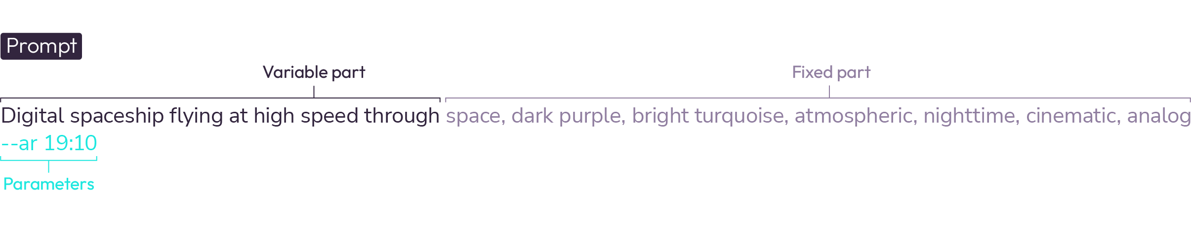
The variable section is editable, while the fixed section ensures consistency and adherence to the brand guidelines. Parameters can be adjusted based on specific requirements, except for --quality. Adjustments should be made carefully, as some parameters may produce experimental or unpredictable results.
Maintaining the prompt structure ensures that the generated image aligns subtly with the brand guidelines. To refine the image further, a step-by-step editing process is carried out using Adobe Photoshop or similar applications. The process includes the following steps:
Create new fill layer, using the color Tolopea #32253E and setting the blending mode to Lighten.
Go to Select -> Color Range and select Cyans. Create a Hue/Saturation adjustment layer and bring the tones as close as possible to Bright Turquoise #1DE7DF.
Go to Select Color Range and select Magentas. Create a Hue/Saturation adjustment layer and bring the tones as close as possible to Light Tolopea #907EA0.
Remove any unnecessary elements that may have been generated by the AI, such as overly bright areas or peculiar shapes.
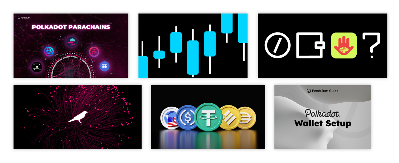
AI-ENHANCED SOCIAL MEDIA ASSETS
The second set of social media assets leveraged AI to enhance visual appeal. These designs included images tailored for Twitter (now X), Medium, and our email newsletter.
WEBSITE
At Pendulum, I managed website design and updates in collaboration with Webflow developers. Over time, we streamlined the process, handling smaller updates independently and involving developers for major changes, such as introducing new pages. The workflow followed a sprint-based approach, beginning with goal identification, solution proposals, prototyping in Figma, and testing before delivering final designs to developers for implementation in Webflow. Prior to my arrival, Adobe XD was used, but it was replaced by Figma due to its superior collaboration and testing capabilities. I also took full responsibility for regular updates, including roadmap revisions and team member additions, which I executed independently.
The Pendulum website integrates AI-generated elements subtly across various pages, enhancing the brand’s visual appeal without overshadowing the message. Its design accommodates the inclusion of internal and external brand elements, ensuring a seamless connection to Pendulum’s identity.
A deliberate decision was made to avoid animations on the main page, prioritizing the clarity and prominence of information over visual effects. The website maintains a clean, modern aesthetic aligned with the brand’s color palette and typography, effectively conveying core values. Navigation is intuitive, and content is structured for easy readability, utilizing white space and visual hierarchies to guide the user’s focus. Infographics and diagrams are strategically incorporated to simplify and clarify complex technical concepts.

Infographics

During my time at Pendulum, one of my most frequent tasks was creating infographic content in various formats and levels of complexity. These infographics were designed to simplify and visually explain complex topics, catering to diverse audiences, including regular Pendulum users, investors, and NGOs.
This infographic effectively guides users through a step-by-step process, using arrows to create a logical and easy-to-follow sequence. The use of color enhances the design by helping users distinguish between actions and sections, while key actions are clearly highlighted for emphasis.
Designed for a broad audience, including beginners in the crypto/DeFi space, the infographic provides clear and simple instructions, avoiding assumptions about the user’s prior knowledge. This accessibility ensures that even new users can confidently follow each step.
The infographic has proven to be highly effective, successfully increasing the number of users providing liquidity on Zenlink by breaking down complex tasks into an approachable and visually appealing format.
This infographic was created to clearly and visually communicate the complex concept of stablecoins in B2B remittance processes. The primary goal was to simplify a highly technical topic while highlighting its benefits, making it accessible to Small and Medium Enterprises (SMEs) with limited knowledge of blockchain technology. Designed as a data-driven narrative, the infographic emphasizes the value of the proposed solution in an engaging manner. Since it was intended for users already familiar with the topic from a prior meeting, the content focuses on supporting data rather than introductory explanations.

Conclusion
Redesigning Pendulum’s brand wasn’t just about refreshing a logo or updating colors: it was about aligning identity with purpose. Through audits, workshops, and deep community engagement, we uncovered a core tension: the need to balance trust and clarity with innovation and ambition. The new brand system is the result of that process, being confident, structured, and distinctly future-oriented.
The launch was met with positive feedback. In the first month, engagement on X posts rose by 6.2%. Community sentiment was strongly positive, with replies and reposts often highlighting the brand as “professional,” “cool,” and “clean.” The brand launch also coincided with Pendulum securing a parachain slot on Polkadot, winning the auction in record time and marking the first milestone of a new chapter for the project.
By translating complex ideas into clear visuals and cohesive messaging, we gave Pendulum a foundation that can scale with its ecosystem. It now speaks fluently to both crypto-native users and institutional partners, without losing its personality or vision. Most importantly, it resonates with the community that helped shape it.
THIRD CASE STUDY
Pendulum Portal and Design System
Summary
The Pendulum Portal is a web application that enables users to manage their interactions with the Pendulum and Amplitude parachains. It serves as a gateway for key tasks such as tracking network metrics, managing account balances, and executing token transactions, all within a streamlined and user-friendly interface. As Pendulum’s ecosystem expanded, the portal struggled to keep up. Given the importance of this interface, which represents the main way to interact with the chain, I proposed and led its redesign. I addressed issues like fragmented pages, inconsistent UI patterns, and misaligned brand elements, which made it difficult for users to navigate with confidence. The result is a flexible and cohesive interface that supports growth, reduces friction, and better reflects the project’s identity.
Goal
We set two objectives: first, to unify Pendulum’s digital presence under a single, coherent design language. Second, to build a flexible component system that would enable the product team to create, expand, and maintain new sections without needing to reinvent the wheel each time. This required rethinking the portal’s architecture, crafting a reusable component library, and ensuring brand consistency and accessibility across all touchpoints.
Challenge
Pendulum’s existing Portal had grown organically over time. Each new section and component was layered on top of the last, resulting in an increasingly disjointed experience. Navigation felt fragmented, mobile behavior was inconsistent, and visual patterns often varied from page to page. The absence of a clear UI logic slowed development and made it difficult to maintain brand consistency. What we needed was not just a redesign of individual elements, but a solid foundation for sustainable scaling.
Research & Foundation
Before jumping into UI or components, I wanted to understand how users experienced the existing ecosystem. I began with a quick content and traffic audit: nearly 42% of visitors to the portal dropped off without performing any action. Mobile usage was around 38%, yet many pages didn’t respond well on smaller screens, making navigation difficult. These gaps helped define our priorities
Improve responsiveness
Structure information clearly
Build a design system flexible enough to scale across use cases and audiences.
PORTAL DESIGN AUDIT


An in-house design audit was conducted with participants from the Product and Marketing teams. I led this initiative by also explaining basics of UI design for us to be on the same page, as we have different levels of knowledge about it. The findings were as follows:
Simplistic color palette:
The interface relies on 3–4 basic tones, which flattens the visual hierarchy and reduces the dynamic feel of the design. The Pendulum brand’s broader color palette should be incorporated to create a more vibrant and engaging interface.Overuse of Nunito Sans:
Nunito Sans is heavily utilized across menus, information blocks, and buttons, with limited use of the Outfit typeface. While Outfit is appropriately applied in titles and input fields, it could be further utilized in CTAs or larger headings to better differentiate key actions and improve visual hierarchy.Insufficient Highlighting of Interactive Elements:
Clickable elements, such as buttons and links, blend in with the surrounding content, making them less intuitive. Interactive components need clearer visual cues, such as hover states, shadows, or accent colors, to improve usability.Poor Hierarchy in Certain Screens:
On the Deposit screen, all elements appear visually equal, making the content feel unformatted.
On the Swap screen, the fees breakdown could benefit from better differentiation between items to improve readability.
Iconography use:
While the icons are functional, there’s potential for improvement to make them more aligned with the overall visual language of the brand.
The UI feels sparse, lacking supplementary graphic elements such as icons or illustrations that could make navigation and interactions more intuitive and engaging. These elements could enhance the overall user experience and reinforce the brand’s identity.
These insights helped us define our next steps: to develop a shared UI language that is clear, scalable, and consistent with the brand.
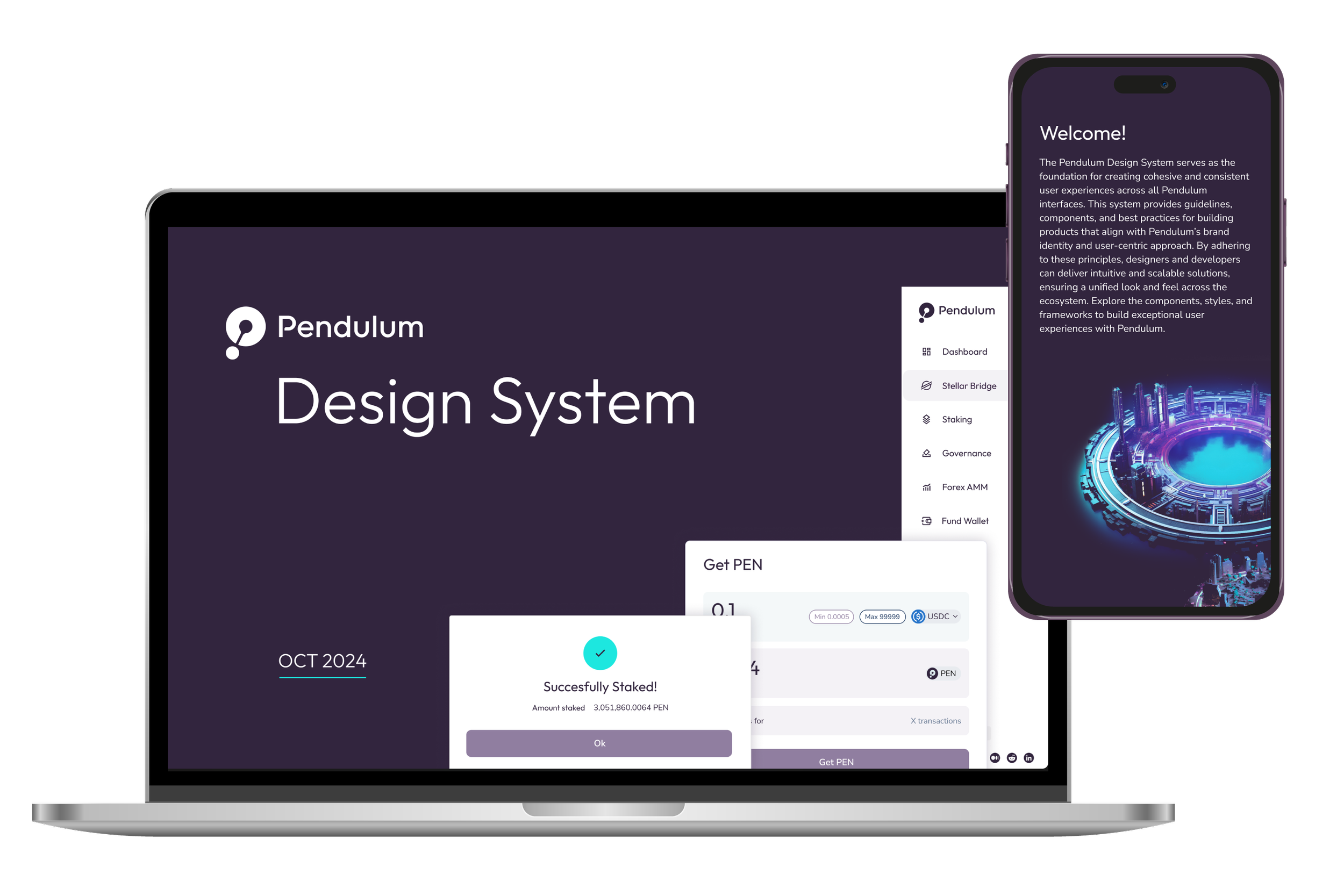
Pendulum Design System
COLORS
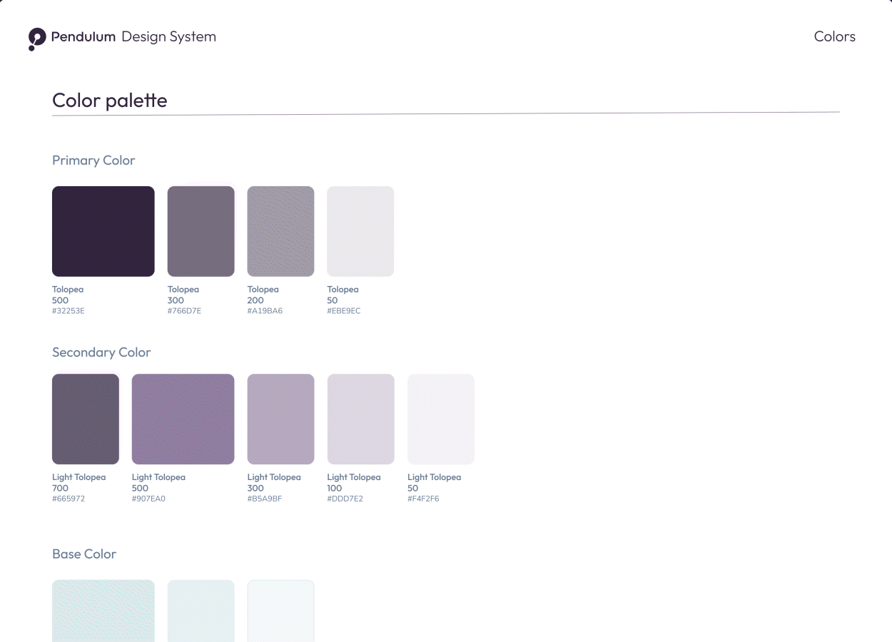
The color palette builds on the brand guidelines, drawing inspiration from Google Material Design’s approach to color. Each color features a range of shades, from light (50) to dark (900), enabling the creation of depth and emphasis for elements like hover states, shadows, and backgrounds.
Primary Color: Tolopea 500, complemented by lighter shades (300, 200, 50) for added versatility.
Secondary Color: Light Tolopea 500, with darker (700) and lighter shades (300, 100, 50) to support various design needs.
Base Color: Tranquil, predominantly used for backgrounds, providing a neutral foundation.
Accent Color: Bright Turquoise, introduced with the design system to add vibrancy and highlight key elements.
Alternative Color: Berkeley Blue, used primarily in buttons, offering additional flexibility in design.
This structured palette ensures visual consistency while enabling dynamic and user-friendly interactions across the interface.
TYPOGRAPHY
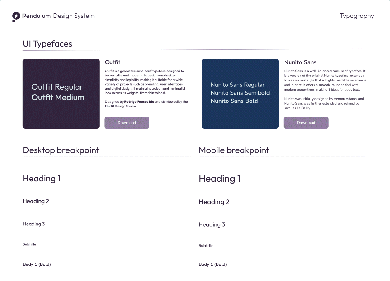
Although the official brand typefaces include Outfit, Nunito Sans, and Steelfish, only the first two are used for user interfaces. Steelfish, being a condensed display font, is reserved for merchandising and other creative applications.
Headings: Outfit is used in three sizes: 36 pt, 24 pt, and 20 pt.
Subtitles: Outfit is also used for subtitles at 16 pt.
Body Text: Nunito Sans is used for body text in three sizes: 18 pt, 14 pt, and 12 pt.
For mobile, we use slightly larger font sizes for better readability:
Headings: Outfit is used in three sizes: 40 pt, 28 pt, and 24 pt.
Subtitles: Outfit is also used for subtitles at 18 pt.
Body Text: Nunito Sans is used for body text in three sizes: 18 pt, 16 pt, and 14 pt.
BUTTONS
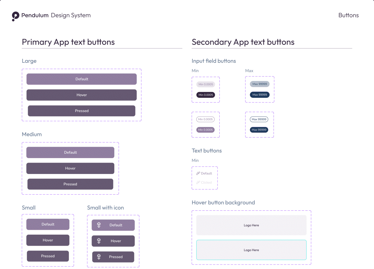
To enhance the usability of buttons and clickable elements, I developed a new button system that retains the dimensions of the previous design while introducing more variability. This includes smaller CTAs, such as buttons for entering minimum or maximum amounts in input fields based on available assets, as well as text buttons, hover states, and special buttons. Additionally, website buttons were standardized and incorporated into the system for consistency.
ICONOGRAPHY
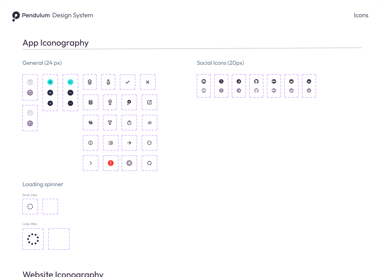
Pendulum’s iconography initially displayed inconsistencies, which were resolved by adopting a style inspired by Google Material Design icons. These icons feature thick lines that align well with the brand’s aesthetic.
Some icons were used directly, while others were custom-designed to serve specific purposes, resulting in a cohesive yet distinct style. All general icons follow a consistent 24 x 24 px size, ensuring uniformity even when proportions vary due to the content. While most icons are outlined, some are filled to suit different functional or visual requirements.
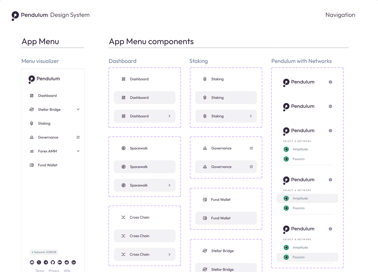
MENU
The menu was redesigned to retain key elements from the previous version while incorporating significant improvements. The typeface was updated to Outfit, and the icon style was refined to align with the newly defined iconography. I also introduced interactive features, such as an improved accordion menu system. Additionally, the transition from “Stellar Bridge” to “Spacewalk” was addressed. This interactive element ensures that even new users, who might not initially know that Spacewalk refers to our Stellar Bridge, can easily understand its purpose, navigate the interface, and use it effectively.
Conclusion
Building the Pendulum Design System laid the foundation for the proper redesign of the Pendulum Portal. The modular component library and shared design tokens provided every team with a unified visual and technical language. It also had a positive impact on the product team by raising awareness of the importance of a structured design system for scaling with confidence and reducing unnecessary iterations. Community feedback was positive, especially regarding the integration of new, highly requested features in a logical and user-friendly way.
More than just a redesign, the system has become infrastructure. It is scalable, accessible, and ready to support any future product Pendulum launches. New pages or components now take just hours to develop, and each update reinforces the brand instead of diluting it. For a fast-moving Web3 project, that level of consistency and speed is not just beneficial, it is a competitive advantage.