

First sketches
First logo ideas, incorporating concepts provided by the client. Citic has five "layers" of action, called arco, marco, cerco, barco and circo. Arco (arch) is the architectural area dedicated to co-designing physical spaces, marco (frame) is the area in charge of inclusion, cerco (fence) is dedicated to natural and environmental preservation, barco (ship) is the area in charge of the use of technology and circo (circus) is about inspiration and wellbeing.

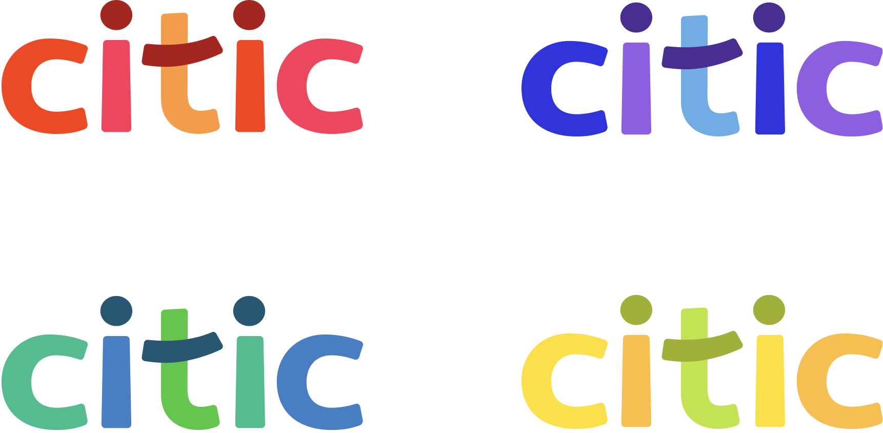
First logotype proposals
The first logotype proposals did not include the idea of the "layers" of action as we noted it would be particularly difficult for the end-user to understand 5 different words that make reference to other concepts. In order to ease the process, we got rid of them as part of the logo and decided to name the layers simply as co-design, inclusion, technology, inspiration and preservation, with the idea of assigning a specific color to each one of them.

Chosen logotype and variations
The chosen logotype is playful and colorful. It uses 5 variations of a 5-color palette and features a smiley created with the dots above the i and the crossbar of the t. This smiley is to become an important part of the brand and a direct way to communicate the company’s spirit.
citic typeface
A typeface was designed based on the chosen logo. Following the brand identity, it is a lowercase-only typeface designed for headlines. It is intended to be playful, fun and childish, as the brand aims to connect with the inner child in all of us.

Iconography
Following the typographic style, we designed a set of icons that could complement the brand identity and be used in infographic content. The smiley was used to create different "emojis" to convey different moods and feelings.

Signage
The signage was developed to be applied transversely in all citic's offices and spaces. It will be manufactured in PVC and also includes Braille text for use by the visually impaired.

Clothing
This is a set of clothing designed to be offered as merchandising in citic spaces. It can also be a gift for citic users, but it is not intended as a uniform, as citic promotes freedom and diversity.

COVID-19 prevention website
Citic commissioned a website to communicate their approach to COVID-19 preventive measures in their spaces. We designed isometric illustrations of the offices and spaces to highlight the correct use of the facilities. The website should scroll down as it explains the measures taken in detail through the use of color and text. This proved to be a success, as it is easy to understand and leaves little room for doubt.
